This slide deck links non-system fonts so rendering is consistent in Chrome and Firefox. When a system font like Helvetica Neue is unavailable, it falls back to a linked webfont.
Typefaces
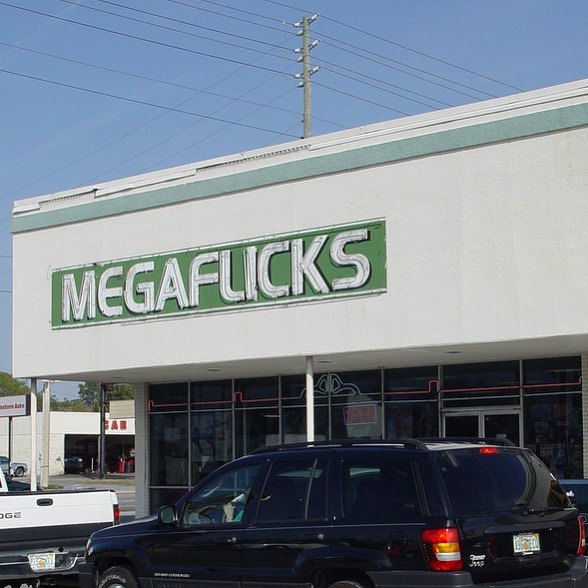
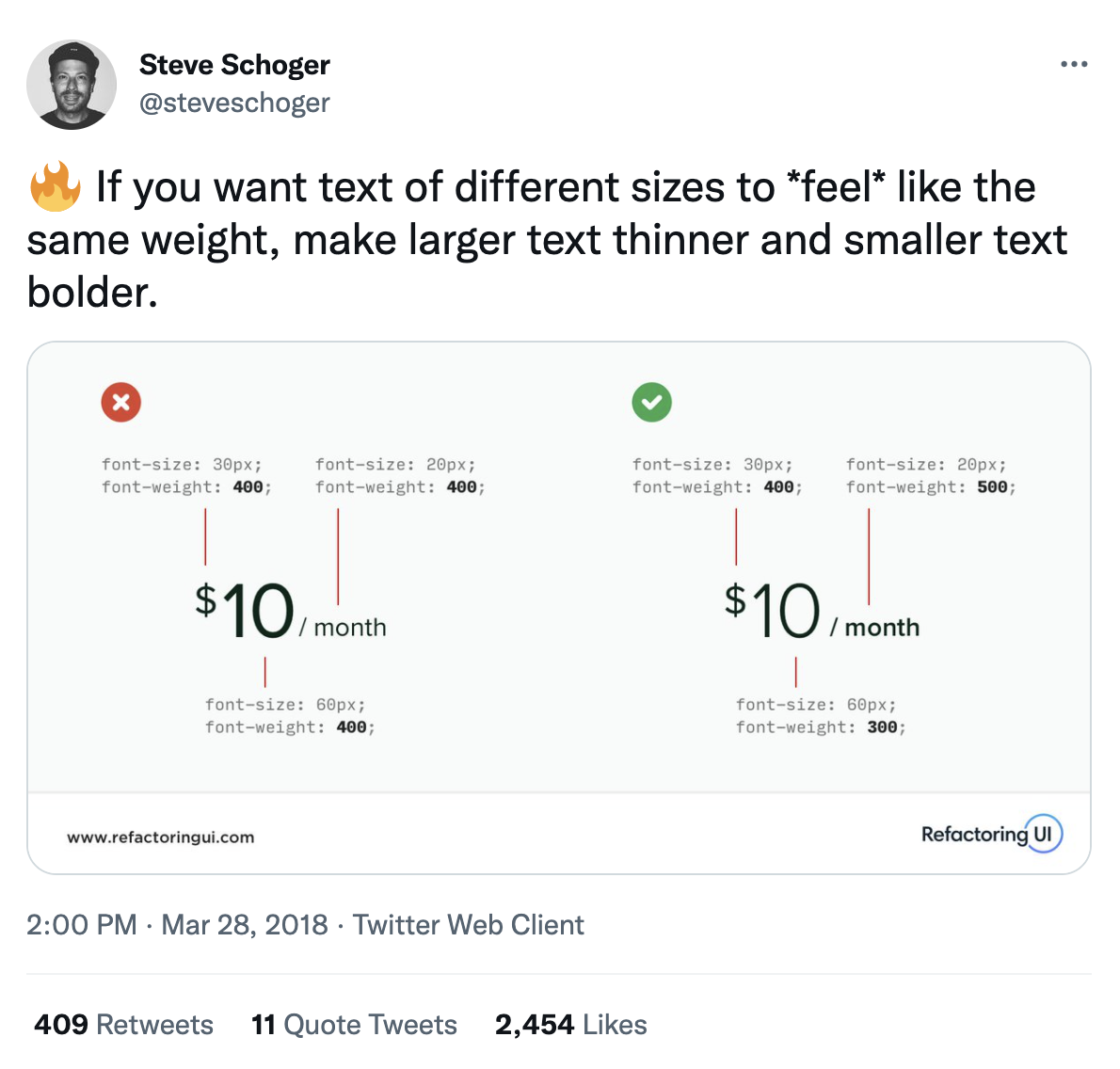
Typography can enhance or hinder communication
The design of a typeface has meaning, it's not just decoration.
Every typeface has a unique personality and purpose.
It enhances communication when used for things
where its design is in tune with the message,
and can fight against the message when used improperly,
looking funny at best, and disturbing at worst (often both!).
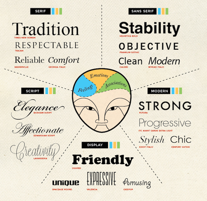
There are different categories of typefaces, and each evoke different adjectives and emotions.
You can read on font psychology to learn more about this.
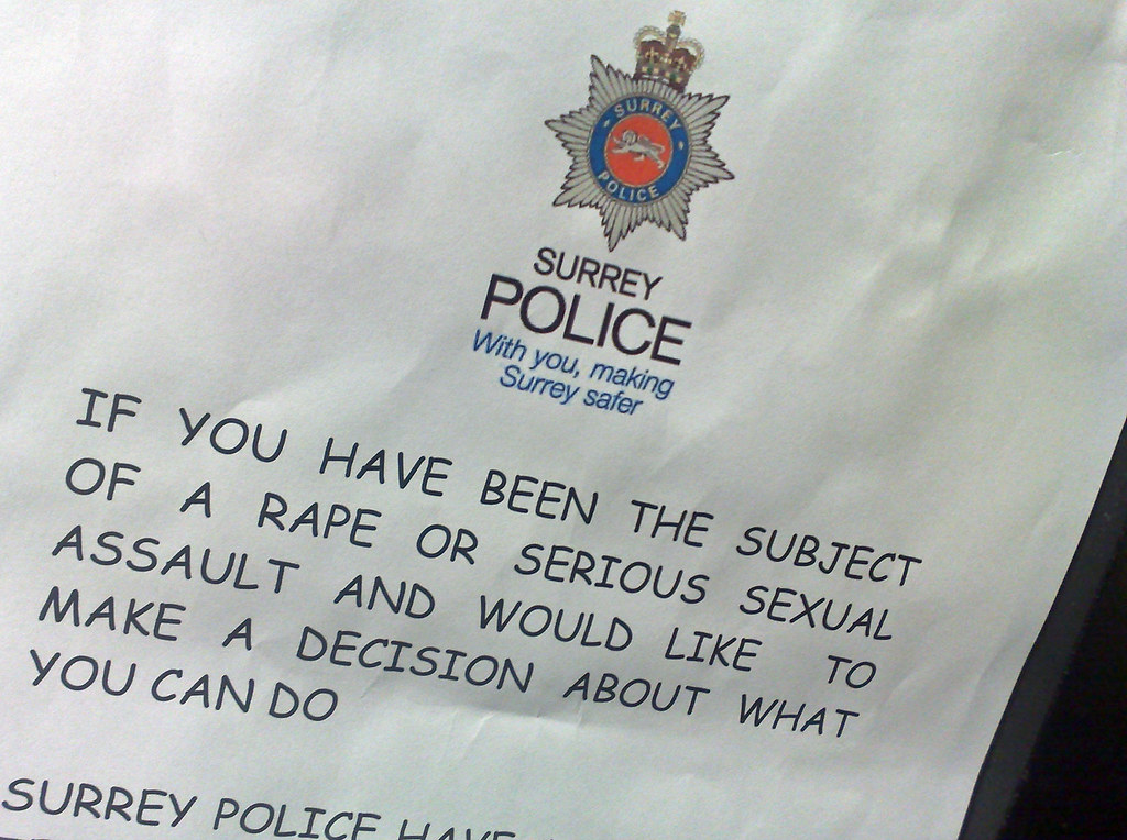
Often, the importance of using appropriate fonts is understood better
when one sees examples of it being badly violated.
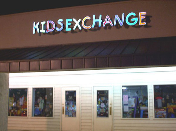
Comic Sans is probably the world's most hated typeface,
and improper usage on a massive scale is one of the main reasons.
Comic Sans was intended to look playful and casual
(in fact it was designed to be used in the comic-like talk bubbles of a program called Microsoft Bob),
so using it on serious, formal content, especially about delicate matters, is highly inappropriate.
font-family: Helvetica Neue, Segoe UI, sans-serif;
In typography, a [serif](https://en.wikipedia.org/wiki/Serif) is a small line or stroke regularly attached to the end of a larger stroke
in a letter or symbol within a particular font or family of fonts.
- Serif typefaces
- Older. More formal.
- Sans serif typefaces
- 1920+. More modern feel.
Therefore, “serif” typefaces are typefaces with serifs,
and “sans-serif” typefaces, are typefaces without serifs.
Are serif typefaces easier to read?
Myth
What about preferences?
- Older studies find a reader preference for serif typefaces
- Recent studies show that users prefer sans serif typefaces for body text online
- In almost all studies, reader preference or perceived legibility is inconsistent with performance
Serif headings, sans serif body text
Sans serif headings, serif body text
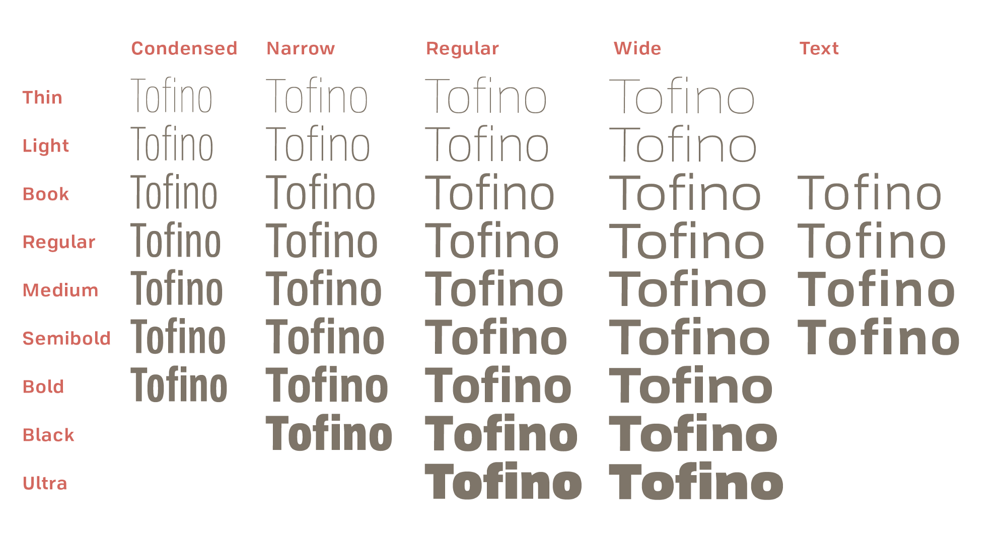
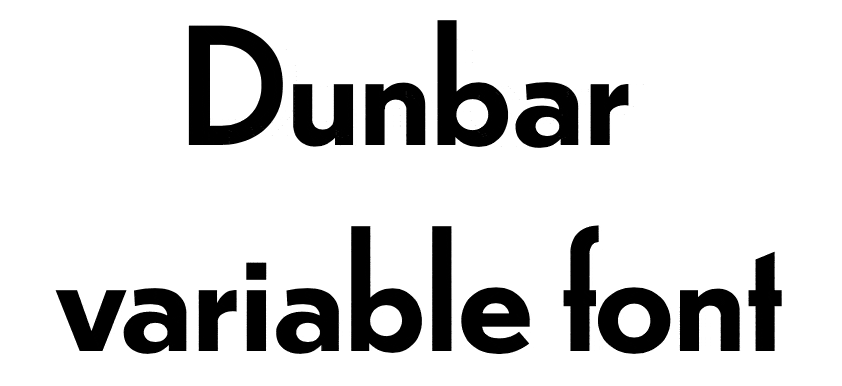
- Variable width
- Each character has a different width
- Monospace
- Each character has the same width. Typewriters, programming code.
Font technology
Going beyond system fonts
		@font-face {
			font-family: Arvo;
			src: url(fonts/s.woff);
			font-weight: bold;
		}

		h1 {
			font-family: Arvo, sans-serif;
			font-weight: bold;
		}
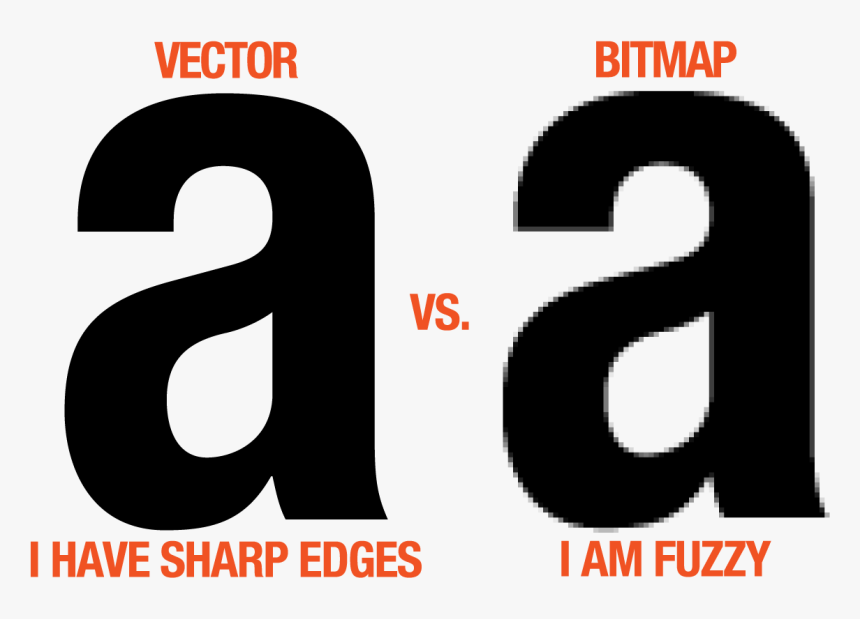
Font file types
| Extension | |
|---|---|
*.woff, *.woff2 |
Web Open Font Format file Compressed font file for the Web. Prefer when available. WOFF 2 provides better compression. |
*.otf, *.ttf |
Font files. *.otf is OpenType, *.ttf is TrueType, a subset of OpenType.
|
*.otc, *.ttc |
OpenType/TrueType Collection: multiple faces in one file.
Currently not supported in @font-face but there are plans for this.
|
*.eot |
Embedded OpenType file Older, IE-specific. Historically significant, but serves no purpose today. |
What is in a font file?
Glyph. n. The visual representation of character(s)
Accented characters
é
- 1 character when used as a precomposed Latin small letter e with acute (U+00E9)
- 2 characters when used as a sequence of Latin small letter e (U+0065) and Combining acute accent (U+0301)
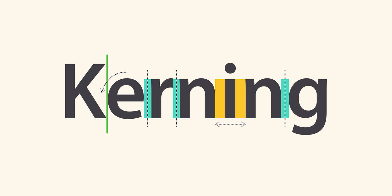
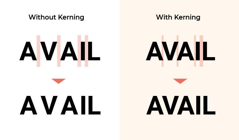
ligature. (ˈlɪgəʧʊə)
n. characters joined together in one glyph to make a more aesthetically pleasing shape
OpenType Features
In some languages like arabic, letter shapes must change based on what is adjacent.
- Rules for alternate glyphs to improve typesetting
- Mandatory for languages like Arabic and Urdu
التصميم
OpenType features
- Each identified by a four letter name (e.g.
liga,dlig,fracetc) - Substitutions described with code which is compiled into the font file
feature liga { sub f f i by f_f_i; sub f i by f_i; } liga;- f
- f
- i
- i
- fi
- fi
- ffi
- ffi
OpenType features & CSS
-
High level:
font-variant-*propertiesfont-variant-ligatures: common-ligatures discretionary-ligatures historical-ligatures contextual; -
Low level:
font-feature-settingsfont-feature-settings: "liga", "clig", "dlig", "hlig", "calt";
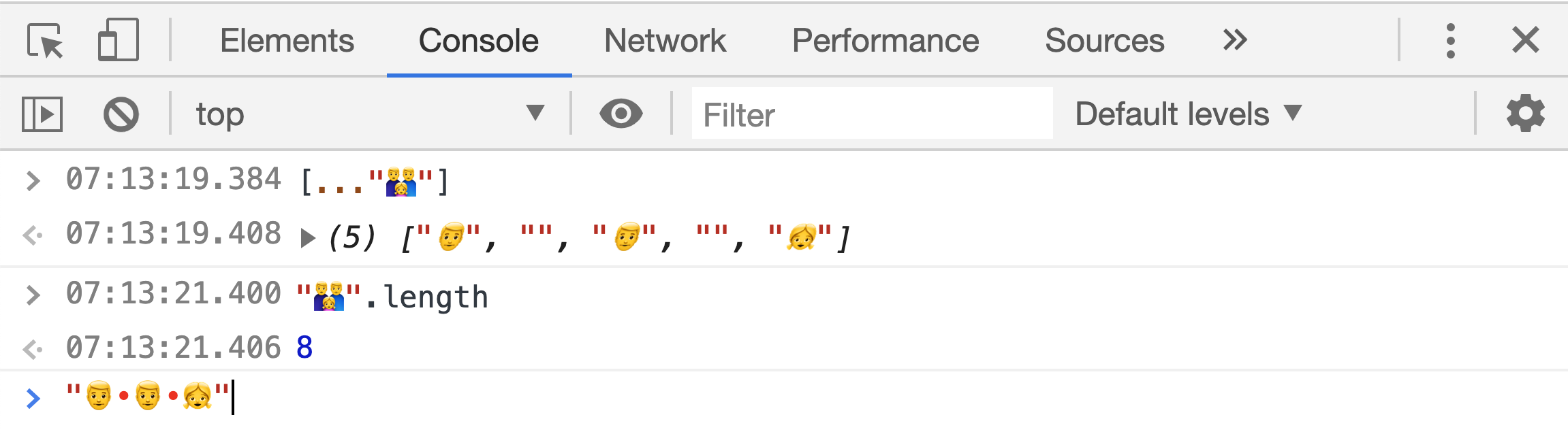
👨👨👧
character(s), glyph(s)
Emoji “ligatures”
👨👨👧 = 👨+ + 👨+ + 👧