Lecture 7 Safety

UI Hall of Fame or Shame?

When2meet
Doodle (for comparison)

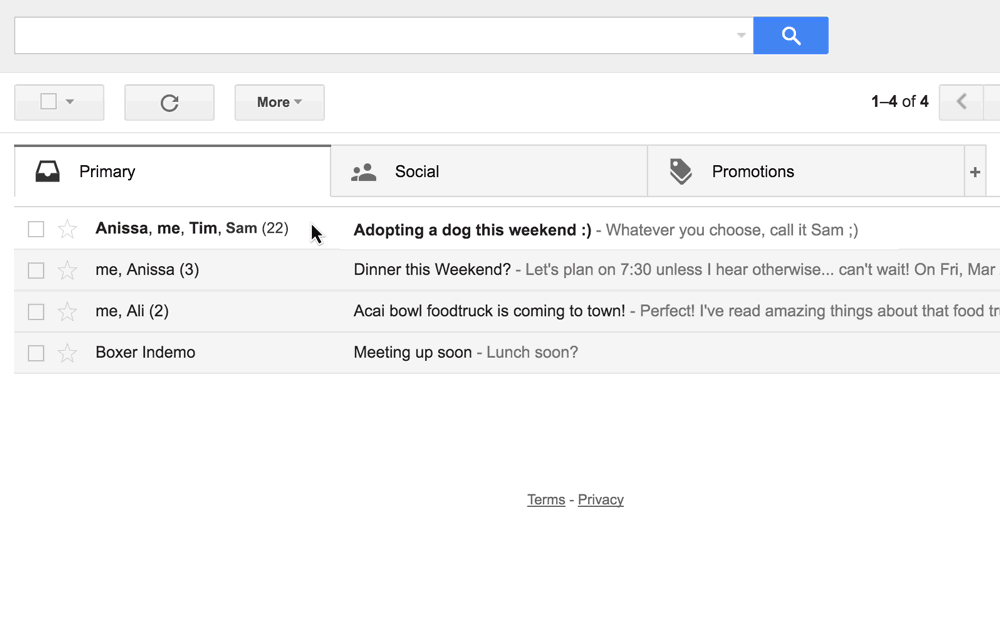
This is a snapshot of When2meet, one of the various web apps currently available for scheduling meeting times. The meeting coordinator is scheduling a weekly meeting, and has asked group members to enter their availability.

The interface for entering availability is distinct from (not externally consistent with) the typical interface for this task, which often has checkboxes or radio buttons for non-overlapping time slots of a fixed length. As a usability test, try entering your weekly availablity into our faux class meeting

How did you learn how to use it?

  • Did you read the directions under the legend?
  • Did your cursor change as you moused over clickable areas? (A perceived affordance)
  • Did you just click around until something happened and learn a conceptual model based on the site’s immediate feedback?
  • How did you figure out how to undo a mistake?

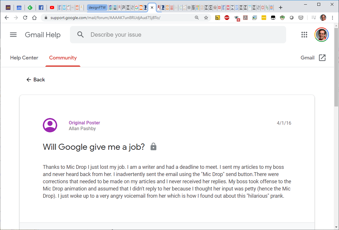
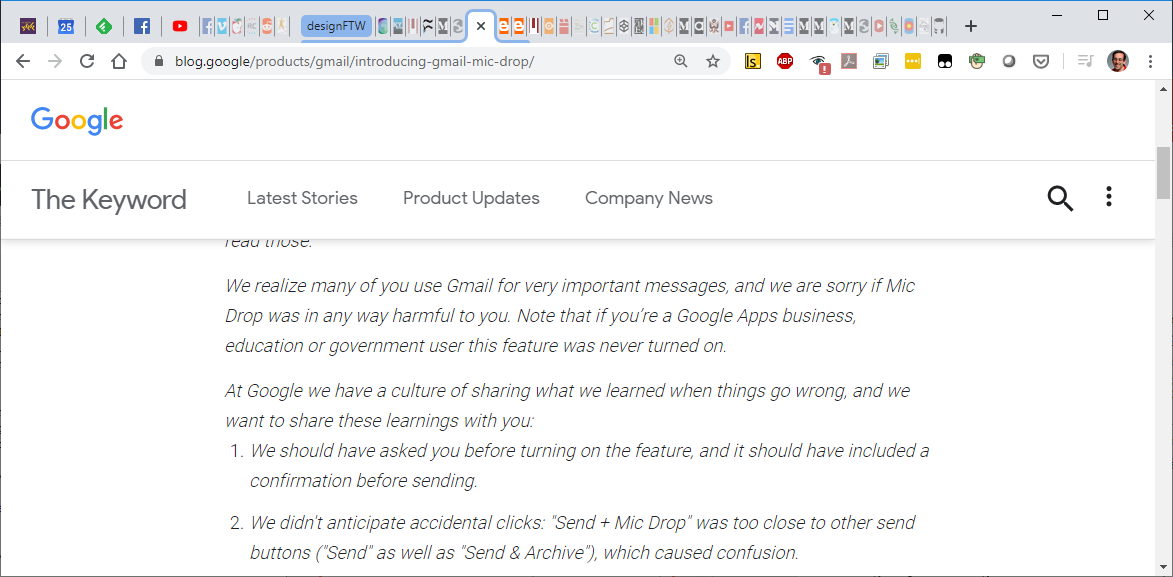
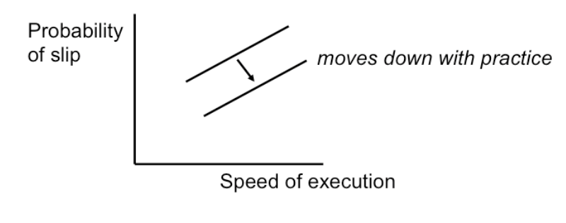
The interface is simple, and can be quickly learned. It starts as a wholly unavailable block, and the user can click and drag to sweep out periods of availability. And yet, it’s not safe.

Half the members of the group entered the inverse of their availability into the site, triggering the scheduling process to start over.

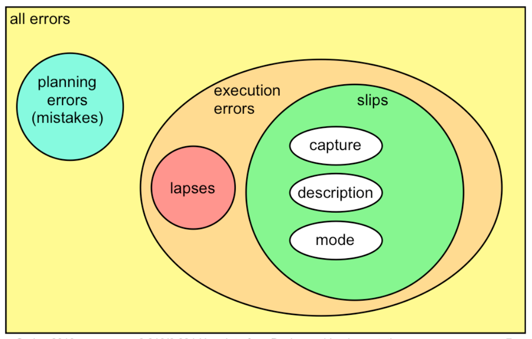
  • Is there something about the interface itself that encourages slips and mistakes?
  • Do you feel equally comfortable thinking about your schedule as periods of availability or unavailability? What change to the interface might help it match your internal representation of your schedule better?

Human Error

Error Type Definitions

Mistake: Planning

  • Person chooses wrong action
  • Incorrect application of rule or knowledge
  • Failure in judgement or inference
  • Less in scope for this class

Slips and lapses: skills

  • Person intends correct action, fails
  • Incorrect application of learned procedure (skill)
  • Often due to lack of attention
  • Rarer per attempt, but more common overall
  • Slip—execution
    • intended action executed incorrectly
  • Lapse—memory
    • intended action omitted/not executed
  • slip: click misses button
  • slip: search, selection, rectangle draw
  • lapse: forget goal or procedure
  • mistake: apply rule wrong; faulty reasoning
  • mistakes rarer because we aren't usually problem-solving
  • but more common per task

Errors can be classified into slips and lapses and mistakes according to how they occur.

Slips and lapses are found in skilled behavior - execution of procedures that the user has already learned. For example, pressing an onscreen button - moving the mouse pointer over it, pressing the mouse button, releasing the mouse button - is a skill-based procedure for virtually any computer user. An error in executing this procedure, like clicking before the mouse pointer is over the button, is a slip. This is just a low-level example, of course. We have many higher-level, learned procedures too - attaching a file to an email, submitting a search to Google, drawing a rectangle in a paint program, etc. An error in execution of any learned procedure would be a slip.

Slips are distinguished from lapses by the source of the failure. A slip is a failure of execution or control - for example, substituting one action for another one in the procedure. A lapse is a failure of memory - for example, forgetting the overall goal, or forgetting where you are in the procedure. A mistake, on the other hand, is an error made in planning or rule application. One framework for classifying cognitive behavior divides behavior into skill-based (learned procedures), rule-based (application of learned if-then rules), and knowledge-based (problem solving, logic, experimentation, etc.) Mistakes are errors in rule-based or knowlege-based behavior; e.g., applying a rule in a situation where it shouldn’t apply, or using faulty reasoning.

Overall, slips and lapses are more common than mistakes, because we spend most of our actual time executing learned procedures. If we spent most of our time problem-solving, we’d never get much done, because problem solving is such a slow, cognitively intensive, serial process. I’ve seen statistics that suggest that 60% of all errors are slips or lapses, but that’s highly dependent on context. Relative to their task, however, slips and lapses are less common than mistakes. That is, the chance that you’ll err executing any given step of a learned procedure is small–typically 1-5%, although that’s context dependent as well. The chance that you’ll err in any given step of rule-based or problem-solving behavior is much higher.

We won’t have much to say about mistakes in this reading, but much research in human error is concerned with this level - e.g., suboptimal or even irrational heuristics that people use for decision making and planning. A great reference about this is James Reason, Human Error, Cambridge University Press, 1990.

Error Types

Taxonomy

Capture Errors

A capture slip occurs when a person starts executing one sequence of actions, but then veers off into another (usually more familiar) sequence that happened to start the same way. A good mental picture for this is that you’ve developed a mental groove from executing the same sequence of actions repeatedly, and this groove tends to capture other sequences that start the same way. In the text editor vi, it’s common to quit the program by issuing the command “:wq”, which saves the file (w) and quits (q). If a user intends just to save the file (:w) but accidentally quits as well (:wq), then they’ve committed a capture error. Microsoft Excel has a curious (and very useful!) class of formulas called array formulas, but in order to get Excel to treat your formula as an array formula, you have to press Ctrl-Shift-Enter after you type it - every time you edit it. Why is this prone to capture slips? Because virtually every other edit you do is terminated by Enter, so you’re very likely to fall into that pattern automatically when you edit an array formula.

Here are some additional examples.

Description Errors

A description slip occurs when two actions are very similar. The user intends to do one action, but accidentally substitutes the other. A classic example of a description error is reaching into the refrigerator for a carton of milk, but instead picking up a carton of orange juice and pouring it into your cereal. The actions for pouring milk in cereal and pouring juice in a glass are nearly identical - open fridge, pick up half-gallon carton, open it, pour- but the user’s mental description of the action to execute has substituted the orange juice for the milk.

Some other pairs that may be prone to description slips are shown above. In the GMail interface on the far right, the three icons - checkbox, star, and important - look very similar to each other when unchecked, opening the way to description slips.

In numerous long past and recent fatal police shootings, police officers claimed to have shot a suspect while intending to draw and use their Taser (see this link)

Google Mic Drop—Sender

April fools “feature” 2016

Google Mic Drop—Recipient

Google Mic Drop—Sender

  • Mic drop replaced Send and Archive
  • Adjacent to normal Reply
  • Description error: confusing Reply with Mic Drop
  • Description error: motor memory for Send and Archive

Google Mic Drop—Recipient

Google Mic Drop—Recipient

Google Mic Drop—Apology

Full story in this Verge article

Mode Errors

  • Modes: states in which actions have different meanings
  • Mode error if user acts in wrong mode
    • Caps Lock
    • Drawing Palette
    • Vi’s insert mode vs. command mode
    • Thunderbird hotkeys
    • Gimp
  • Likely when mode is hard to notice

Another kind of error, clearly due to user interface, is a mode error. Modes are states in which the same action has different meanings. For example, when Caps Lock mode is enabled on a keyboard, the letter keys produce uppercase letters. The text editor vi is famous for its modes: in insert mode, letter keys are inserted into your text file, while in command mode (the default), the letter keys invoke editing commands. In Gimp pressing a hotkey while you hover over a meny item changes the hotkey to bind to that menu item instead of invoking the (original) command. In Thunderbird, many of the hoteys are plain lowercase letters—no control key modifier. So if you start typing a letter but don't have the compose window open, you end up triggering tons of commands.

Mode errors occur when the user tries to invoke an action that doesn’t have the desired effect in the current mode. For example, if the user means to type lowercase letters but doesn’t notice that Caps Lock is enabled, then a mode error occurs.

Mode errors are generally slips, an error in the execution of a learned procedure, caused by failing to correctly evaluate the state of the interface.

Causes of Slips

  • “Strong-but-wrong” effect
    • Similarity
    • High frequency
  • Inattention or inappropriate attention
    • So more common among experts!
    • Not always negligent—high stress situations
  • Speed / accuracy tradeoff
    • log(correctness odds) linear in reaction time
    • constant factor improved by practice

The slips and lapses we’ve discussed have a few features in common. First, the root cause of these errors is often inattention. Since slips and lapses occur in skilled behavior, execution of already well-learned procedures, they are generally associated with insufficient attention to the execution of the procedure, or omission or distraction of attention at a key moment.

Second, the particular erroneous behavior chosen is often selected because of its high similarity to the correct behavior (as in capture and description slips), or of its high frequency relative to the correct behavior (as in capture slips). Very common, or very similar, patterns are strongly available for retrieval from human memory. Errors are often strong-but-wrong behavior.

Finally, we can tune our performance to various points on a speed-accuracy tradeoff curve. We can force ourselves to make decisions faster (shorter reaction time) at the cost of making some of those decisions wrong.

Conversely, we can slow down, take a longer time for each decision and improve accuracy. It turns out that for skill-based decision making, reaction time varies linearly with the log of odds of correctness; i.e., a constant increase in reaction time can double the odds of a correct decision.

The speed-accuracy curve isn’t fixed; it can be moved down and to the right by practicing the task. Also, people have different curves for different tasks; a pro tennis player will have a high curve for tennis but a low one for surgery.

One consequence of this idea is that efficiency can be traded off against safety. Most users will seek a speed that keeps slips to a low level, but doesn’t completely eliminate them.

Error Prevention

Safety from Capture Errors

Safety from Description Errors

  • Avoid actions with very similar descriptions
  • Keep dangerous commands away from common ones
  • Police changed policy to require taser on "weak hand" side vs. gun on "strong hand" side.
  • Avoid long rows of identical buttons
  • Outloook 2003 attachments menu put remove next to save as. why bad?
  • Also, remove is not undoable
  • Ipad mail app puts delete next to reply

Description errors can be fought off by applying the converse of the Consistency heuristic: different things should look and act different, so that it will be harder to make description errors between them. Avoid actions with very similar descriptions, like long rows of identical buttons.

You can also reduce description errors by making sure that dangerous functions (hard to recover from if invoked accidentally) are well-separated from frequently-used commands. Outlook 2003 made this mistake: when you right-click on an email attachment, you get a menu that mixes common commands (Open, Save As) with less common and less recoverable ones - if you print that big file by mistake, you can’t get the paper back. And if you Remove the attachment, it’s even worse - undo won’t bring it back! (Thanks to Amir Karger for this example.)

Unfortunately the Mail app on the iPad also makes this mistake - the Delete and Reply buttons are right next to each other. (thanks to Alexander Ivanov for this example)

Safety from Mode Errors

There are many ways to avoid or mitigate mode errors. Eliminating the modes entirely is best, although not always possible. Modes do have some uses - they make command sets smaller, for example. When modes are necessary, it’s essential to make the mode visible. But visibility is a much harder problem for mode status than it is for affordances. When mode errors occur, the user isn’t actively looking for the mode, like they might actively look for a control. As a result, mode status indicators must be visible in the user’s locus of attention. That’s why the Caps Lock light, which displays the status of the Caps Lock mode on a keyboard, doesn’t really work.

Other solutions are spring-loaded or temporary modes. With a spring-loaded mode, the user has to do something active to stay in the alternate mode, essentially eliminating the chance that they’ll forget what mode they’re in. The Shift key is a spring-loaded version of the uppercase mode. Drag-and-drop is another springloaded mode; you’re only dragging as long as you hold down the mouse button. Temporary modes are similarly short-term. For example, in many graphics programs, when you select a drawing object like a rectangle or line from the palette, that drawing mode is active only for one mouse gesture. Once you’ve drawn one rectangle, the mode automatically reverts to ordinary pointer selection.

Finally, you can also mitigate the effects of mode errors by designing action sets so that no two modes share any actions. Mode errors may still occur, when the user invokes an action in the wrong mode, but the action can simply be ignored rather than triggering any undesired effect.

Confirmation Dialogs

  • Avoid unless necessary
  • If too common, users habituate confirming every operation (capture error)
    • Therac 25
  • In general, reversibility is better
  • But, may need to confirm significant irreversible actions

An unfortunately common strategy for error prevention is the confirmation dialog, or “Are you sure?” dialog.

It’s not a good approach, and should be used only sparingly, for several reasons:

  • Confirmation dialogs can substantially reduce the efficiency of the interface. In the example above, a confirmation dialog pops up whenever the user deletes something, forcing the user to make two button presses for every delete, instead of just one. Frequent commands should avoid confirmations.
  • If a confirmation dialog is frequently seen - for example, every time the Delete button is pressed - then the expert users will learn to expect it, and will start to include it in their habitual procedure. In other words, to delete something, the user will learn to push Delete and then OK, without reading or even thinking about the confirmation dialog! The dialog has then completely lost its effectiveness, serving only to slow down the interface without actually preventing any errors.

In general, reversibility (i.e. undo) is a far better solution than confirmation.

Even a web interface can provide at least single-level undo (undoing the last operation). Operations that are very hard to reverse may deserve confirmation, however. For example, quitting an application with unsaved work is hard to undo - but a well designed application could make even this undoable, using automatic save or keeping unsaved drafts in a special directory.

Github

Facemail (Miller Lab)

Reply

Reply All

Error Messages

Writing Error Message Dialogs

Finally, let’s talk about how to write error messages. But before you try to write an error message, stop and ask yourself whether it’s really necessary. An error message is evidence of a limitation or lack of flexibility on the part of the system - a failure to prevent an error or absorb it without complaint. So try to eliminate the error first.

Some errors simply aren’t worth a message. For example, suppose the user types “abc” into the font size combo box. Don’t pop up a message complaining about an “invalid entry”. Just ignore it and immediately replace it with the current font size. (Why is this enough feedback, for a font size combo box?) Similarly, if the user drags a scrollbar thumb too far, the scrollbar doesn’t pop up an error message (“Too far! Too far!”). It simply stops. If the effect of the erroneous action is easily visible, as in these cases, then you don’t have to beat the user over the head with a superfluous error message.

The figure shows an example of an error message that simply shouldn’t happen. Forbidding dashes and spaces in a number that the user must type, like an account number or credit card number, is poisonous to usability. (Why are dashes and spaces helpful for human perception and memory?) There’s a great collection of error messages like this at the No Dashes or Spaces Hall of Shame (http://www.unixwiz.net/ndos-shame.html).

Be Precise and Comprehensible

Assuming you can’t design the error message out of the system, here are some guidelines for writing good ones.

Be precise. Don’t lump together multiple error conditions into a single all-purpose message. Find out what’s really wrong, and display a targeted message.

If the error is due to limitations of your system, like sizes or allowed characters, then be specific about what the limitations are, so that the user can adapt. (Then ask yourself why you have those limitations!)

It often helps to restate the user’s input, so that they can relate what they did to the error message, and perhaps even detect the problem immediately (“oh, I didn’t mean paper.doc…”)

In error messages, it’s particularly important to speak the user’s language, and avoid letting technical terms or details like exceptions and stack traces leak through.

Suggest Reasons and Solutions

Next, your message should be constructive, not just reporting the error but helping the user correct it. Suggest possible reasons for the error and offer ways to correct them–ideally in the error message dialog itself. Here’s a good example from Adobe Acrobat.

Be Polite

Finally, be polite. The message should be worded to take as much blame as possible away from the user and heap the blame instead on the system. Save the user’s face; don’t worry about the computer’s. The computer doesn’t feel it, and in many cases it is the interface’s fault anyway for not finding a way to prevent the error in the first place. It’s interesting to contrast what the original 1984 Mac said when it crashed (an apology!) with the dialog shown below.

The confirmation dialog on the bottom isn’t an error message, strictly speaking, but it does show incorrect attribution of blame. The user shouldn’t have to apologize!

Avoid Loaded Words

Many words that are unfortunately common in technical error messages have emotionally-charged meanings in ordinary language; examples include “fatal”, “illegal”, “abort”, etc. Avoid them. Use neutral language. Windows and DOS have historically been littered with messages like these.

The tooltip shown at the bottom isn’t strictly an error message, but it actually appeared in a production version of AutoCad! As the story goes, it was inserted by a programmer as a joke, but somehow never removed before release. Even as a joke, it demonstrates a lack of respect for the intelligence of the human being on the other side of the screen. That attitude is exactly wrong for user interface design.

User Control and Freedom

User Control and Freedom

Good interfaces are explorable. Recall that a major way users learn is by doing: poking around an interface, trying things out. An interface should encourage this kind of exploration, not only by making things more visible, but also by making the consequences of errors less severe.

For example, users navigating around a 3D world or a complex web site can easily get lost; give them an easy, obvious way to get back to some “home”, or default view. Users should be able to explore the interface without fear of being trapped in a corner.

User control and freedom (a term coined by Jakob Nielsen) is the idea that in the give and take between the user and the system, the user should have ultimate control.

Clearly Marked Exits

Long operations should be cancelable
All dialogs should have a cancel button

The simplest kind of user control is a veto - the ability to cancel an operation, even if it was something they asked for. Users should not be trapped by the interface. Long operations should not only have a progress bar, but a Cancel button too. Likewise, every dialog box should have a Cancel button. Where is it in this CuteFTP dialog box on the bottom? As a user of this dialog, would you feel like you’re in control?

Who’s in Control? What are Tradeoffs?

Wizard

  • Step by step
  • Dialog boxes
  • System controls process
  • Back and Cancel buttons essential

Center Stage

  • Many objects in window
  • User chooses which to interact with

Let’s look a little further at who controls the dialog between the user and the system. (Here, dialog means the general pattern of back-and-forth communication between the user and the interface, as if the user and the system are having a conversation. A dialog box is a specific kind of window, a design pattern used in a dialog.

We often say dialog as a shorthand for dialog box, but hopefully the distinction will be obvious from context.)

We’ll contrast two patterns. The wizard design pattern is a familiar pattern for improving the learnability of a complex interaction, by structuring it as a step-by-step process, showing each step in a dialog box. Wizards are the conventional pattern for software installation. In a wizard, the system controls the dialog - it dictates the steps, the ordering of the steps, and what it asks for at each step. Imagine a sales agent who’s asking you a series of questions, and refuses to listen to what you say if it’s not relevant to the question they asked. That’s a wizard.

Contrast that with the center stage pattern, which lays out data objects in the main section of the window, and gives the user a set of tools for operating on the objects. In this case, the user controls the dialog, deciding which objects to select and which tools to pick up.

Wizards clearly restrict the user’s freedom, but for complex, infrequently-done tasks (like installation), the tradeoff is often worth it. Note, however, that a good wizard has two key features: a Back button (for backing out of errors) and a Cancel button (for vetoing the operation entirely). So even though the wizard pattern puts the system in control of the details, the user still has supervisory control.

Manual Overrides for Automatic Systems

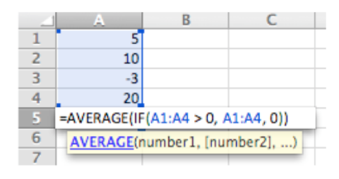
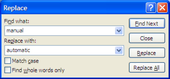
Isn't Replace All less work, so always better?
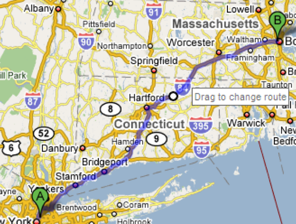
After route generation, user can drag route to tweak.

One of the main reasons we build software in the first place is to automate a process, taking some burden off the human users. But we can’t take away control entirely. Users should be able to manually override automation.

The familiar Find & Replace command is a simple example of this. If Find & Replace were perfectly automatable, then all we’d need is Replace All. But the world isn’t that simple, and our documents are full of exceptions or incompletely-specified patterns, and there are plenty of cases where the user needs manual control over replacement - hence the Find Next and Replace buttons. Google Maps offers an example of a different kind of control - starting with the output of an automatic algorithm (the shortest route between two points) and manually tweaking it (dragging the route around).

Systems that solve big or complex optimization problems should offer the user the opportunity to make these tweaks, since often there are constraints or preferences that are difficult to specify in advance, but can easily be seen when a solution is presented.

The Real World is Fuzzy

Computers rarely handle full fuzziness of real world
  • Forcing the user to do it the computer's way is bad
  • Put room for fuzzy stuff in the system
  • "Notes" fields are common in structured data tools

Some HCI researchers (prominently, Austin Henderson) argue that computer science in general, and corporate system developers in particular, have gone too far in trying to regularize the world, building systems that demand coherence from their users and their environment, expecting input that fits into expected categories and rejecting all others. For example, stating that every person has a first name and a last name, or assuming that every city belongs to only one country, or demanding a single shipping address for an order, are claims about the coherence of the world. But the real world is fuzzy, full of exceptions and oddities, and we should build pliant systems that can survive the exceptions. A great example of how paper-based systems are pliant is the marginal comment. Here’s a card from an old-fashioned card catalog. You can easily distinguish the coherent typewritten data, which might fit neatly into a database system nowadays, from the marginalia.

Margins on paper forms are often used by experienced workers to get their jobs done when the form is inadequate. We have a few design patterns for pliant user interfaces - such as comment fields (though they appear very rarely in business software!), and tagging instead of rigid hierarchies - but we don’t really know how to build systems that are coherent enough for automation yet still pliant enough for the real world. (Jon Udell, “Filling in the Margins“)

Never Ask Me Again

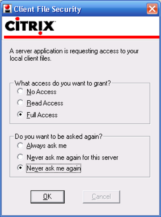
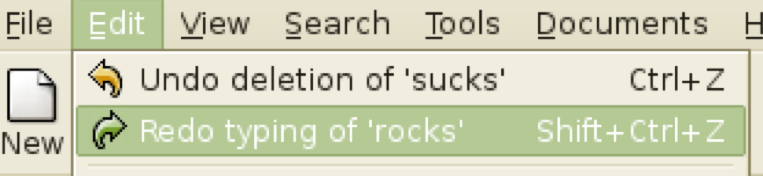
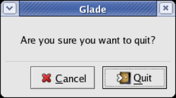
What if I change my mind?

Here’s an interesting problem related to who’s in control of the dialog. Many interfaces interrupt users with questions, like the dialog boxes shown here. If the answer is always the same, it’s clearly inefficient (and annoying) to keep asking the same question repeatedly - so many of these dialogs offer the option Never ask me again.

Good idea, and superficially seems to improve user control, because it’s like a veto over all future questions of the same type. But suppose later the user wants to change their decision? Because the system initiated this dialog, not the user, the user has no idea how to return to the question. And the system has promised never to ask it again! It’s a Catch-22.

One patch to this problem can be seen in the Firefox dialog box on the bottom - a help message that tells the user where to look to undo the decision. But remember that just because the user has seen a message doesn’t mean they’ve learned what it had to say. It’s not clear that this really fixes the problem, but I haven’t seen any better solutions.

User Control Over Data

So we’ve discussed user control over the dialog. Let’s now consider user control over the data itself.

Editing is important. If the user is asked to provide any kind of data - whether it’s the name of an object, a list of email attachments, or the position of a rectangle - the interface should provide a way to go back and change what the user originally entered - rename the object, add or remove attachments, move around that rectangle some more. Data that is initialized by the user but can never again be touched will frustrate user control and freedom. Keep CRUD in mind - if you can Create an object or data field, you should be able to Read, Update, and Delete it, too.

Providing user control and freedom can have strong effects on your backend model. You’ll have to make sure data are mutable. If you built your backend assuming that a user-provided piece of data would never change once it had been created, then you may have trouble building a good UI. One way that can happen is if you try to use user-provided data as a unique identifier in a database, like the user’s name, or their email address, or their phone number, or the title of a document. That’s generally not a good practice, because if any other object stores a reference to the identifier, then the user won’t be able to edit the identifier without breaking that reference.

No Arbitrary Limits on User-Defined Names

If an interface allows users to name things, then users should be free to choose long, descriptive names, with any characters or punctuation they want. Artificial limits on length or content should be avoided. DOS used to have a strong limit on filenames, an 8 character name and a 3 character extension, and a variety of punctuation characters are forbidden from filenames. Echoes of these limits persist in Windows even today.

Here’s a bizarre requirement from Facebook (source: Error’d–The Daily WTF). No doubt the programmer’s intention was to reject randomly-generated or nonsensical names which would reduce Facebook’s appearance of professionalism, but the rule clearly doesn’t work.

Undo

Support Undo

Desktop

Web

Revision history

  • original mac supported one undo stop
  • modern desktop software effectively unbounded
  • web can be limited e.g. one step in gmail
  • alternate model: version histories

If Cancel is the most common answer for user control over dialog, then Undo is the most common answer to user control over data. Undo has been around in desktop applications since the dark ages of the first Macintosh, if not before. The first Mac applications supported only single-level undo - that is, you could undo the last command, but no farther. This was largely due to memory constraints, and modern desktop applications allow unlimited undo (or so much that it makes no difference given the current interface for Undo - nobody is going to press Ctrl-Z 1000 times, after all).

Undo is also gradually appearing in web applications, like GMail. GMail’s interface (shown here) only supports single undo. But other web applications support much longer undo histories, particularly apps designed for collaboration, like wikis. In these apps, undo typically takes the form of a revision history, rather than an undo command.

Forming a Mental Model of Undo

You may think it’s obvious what the Undo command does: it reverses the effect of the user’s last action. But it’s not as simple as that. Undo’s behavior can be mysterious. Undo is an example of a case where the system model is not well communicated by the user interface. The actions managed by Undo are not visible; there’s no persistent, visual representation showing the next action to be undone. (Not quite true: in well-designed interfaces, the Undo menu command’s label gives a hint, like “Undo Typing” or “Undo Bold”. But it’s not prominent, so it doesn’t particularly help a user form their mental model from ordinary use.) If you ask users to predict what effect Undo will have in some particular case, they may have no idea.

Let’s look at some of the questions we should ask when we’re designing an undo mechanism.

What will be undone?

Undo reverses the last action made by the user, but it’s not necessarily the last one in the global stream. There is no global Undo in current GUI environments. Each application, sometimes even each widget, offers its own Undo command. A particular Undo command will only affect the action stream of the application or widget that it controls - so it will undo the last action in that application or widget’s stream, which isn’t necessarily the last command the user issued to the system as a whole.

Some applications use a separate action stream for each window. Microsoft Word works this way, for example. If you type something into Word document A, then type something else into Word document B, then switch back to A and invoke Undo, then A’s insert will be undone - even though B’s insert is the last one you actually performed. But Microsoft Excel, despite being part of the same office suite, has a global action stream. Invoking Undo undoes actions from across all open Excel windows.

Other applications treat each text widget as a separate action stream. Web browsers behave this way. Try visiting a form in a web browser, and type something into two different fields. You’ll find that Undo only affects the field with the current keyboard focus, ignoring actions you made on any other fields. Changes made in other kinds of form widgets - drop-down menus or listboxes, for example - aren’t added to any action stream.

Applications with multiple simultaneous users - such as a shared network whiteboard, where anybody can scribble on it - face the question of whether Undo should affect only your own actions, or everybody’s actions. Usually, the best answer to this question is only your own actions, unless you have some kind of floor control mechanism that prevents people from working simultaneously. (See Abowd & Dix, “Giving undo attention,” Interacting with Computers, v4 n3, 1992).

How is the stream divided into units?

  • Lexical Level
    • Mouse clicks, moves; key presses
    • Nobody does this
  • Syntactic level
    • Commands and button presses
  • Semantic level
    • Changes to application data structures (e.g. result of entire Format dialog
    • This is the normal level
    • What if was long, complex?
  • Text entry is aggregated into one action
    • But other editing commands (like Backspace) and newlines interrupt the aggregation
  • What about user-defined macros?
    • Undo macro actions individually, or as a unit?

Once you’ve decided which stream of actions to undo, the next question is, how is the stream divided into units? This is important because Undo reverses the last unit action of the stream.

Dividing at the lexical level means low-level input events, so Undo might reverse the very last keyboard or mouse change. For example, if you just did a drag-and-drop, invoking Undo might undo your mouse button release, putting you back into drag-and-drop mode and allowing you to drop somewhere else. No user interface (that I know of) implements lexical Undo in a systematic way; it’s not clear how to get it right (since you’re not holding the button down anymore!), and it’s probably not what users want.

At the syntactic level, you would undo commands or onscreen button presses. For menu items and toolbar buttons, this is the right thing. But if you just finished a dialog - say, using the Font dialog, or selecting a Color - then this would undo the OK button press, returning you into the dialog box. Most applications don’t do it at this level either.

The semantic level is what most designers choose, where Undo reverses the most recent change to the backend model - whether it was caused by a simple command, like Boldface, or a complicated dialog, like Page Layout. That’s great for one kind of user control and freedom, since it makes complex changes just as easy to back out of as simple changes. But what if you just completed a long wizard dialog, only to discover that it didn’t do what you wanted, and Undo only reverses the effect of the entire dialog, instead of getting you back into the wizard and letting you Back up? There are tradeoffs in the decision to undo only at the semantic level, but it’s the most common.

For undoing text, individual typed characters should be aggregated somehow - otherwise, Undo won’t be any faster than pressing Backspace. One natural way to do this might be word boundaries; but most text editors use edit commands and newlines as boundaries.

In general, the action stream should be divided into chunks from the user’s perspective. For example, a user-defined macro is a chunk, so Undo should treat the entire macro as a unit action.

Which actions are undoable?

Many actions that affect visible program state may be completely ignored by Undo. Typically these actions affect the view, but don’t actually change the backend model. Examples include selection, keyboard focus, scrolling and zooming, window management, and user interface customizations.

Since easy reversibility can be just as helpful for view changes, some applications define new commands for them, so they can reserve Undo for reversing model changes. Web browsers are a fine example: the Back button reverses a jump in view (whether caused by loading a new page or clicking on an internal hyperlink to jump to another place in the same page). Development environments like Eclipse have borrowed this idiom for navigation in code editors; you can press Back to undo window switching and scrolling.

How much state is recovered?

Even if the Undo stream doesn’t include all the view changes you make, how much of the view state will be restored when it reverses a model change? When you undo a text edit, for example, will the selection highlight be restored as well? Will the text cursor be put back where it was before the edit? If the text scrolls, will it be scrolled back to the same place?

How far back can you undo?

Finally, how far back will the undo history stream go? Old Macintosh applications had only single undo - i.e., you could only undo the last action, and no farther. Thankfully, cheap memory has made deep undo history feasible and commonplace. Even though memory no longer limits undo, the conventional model of undo still does. In most applications,

Undo is a transient phenomenon, limited to a single application session. If you shut down the application, and then restart it, the undo history is erased. So you can’t undo past the start of the current session.

Some applications even erase the undo history as soon as the user saves a document to disk. Older versions of Microsoft Office used to behave this way.

Forward Error Recovery

Users may not even think of reaching for Undo if the rest of your interface makes it easy to reverse undesired changes. Undo is a form of backward error recovery, which fixes errors by going back in time. A more natural way of thinking is forward error recovery - using other commands to reverse the change. For example, to undo a Bold command by forward error recovery, you select the text again and toggle Bold off. If your interface supports forward error recovery as much as possible, then warts in the Undo model won’t hurt as much.

Design Principles for Undo

The upshot of all these questions is that it’s very hard for users to predict what Undo will do. Faced with this unpredictability, a common strategy is to press Undo until you see the effect you want to reverse actually go away, or until you realize it’s gone too far without solving the problem (i.e., it’s reversed an older, still-desired effect). So visibility of Undo’s effects is a critical part of making it usable. Whenever Undo undoes a command, it should make sure that the effects of that have a visible change on the screen. If the user has changed the viewpoint (e.g. scrolling) since doing the command that is now being undone, the viewpoint should be changed back, so that it’s easy to see what was reversed.

The unit actions should correspond to chunks of the user’s interaction: whole typed words (or strings), complete dialogs, user-defined macros.

Undo itself should be reversible, so that if you overshoot, you can come back. That’s what the Redo command is for. Another way to reverse an Undo is to manually issue the undone command again; a good undo mechanism should set up the conditions for this as well.

For example, suppose you select a range of text and Delete it, and then Undo that deletion. The editor should not only restore the text, but also restore the selection highlight, so that you can immediately press Delete to delete the same text again.

For consistency, reserve the Undo command for model changes. You can use other commands for view changes. Keep in mind that you don’t necessarily need a command named “Undo” to support reversibility.

There are other commands that move through other action streams (Back), and physical manipulations (like scrollbar dragging) support direct reversibility.

Summary