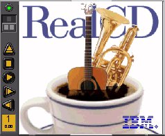
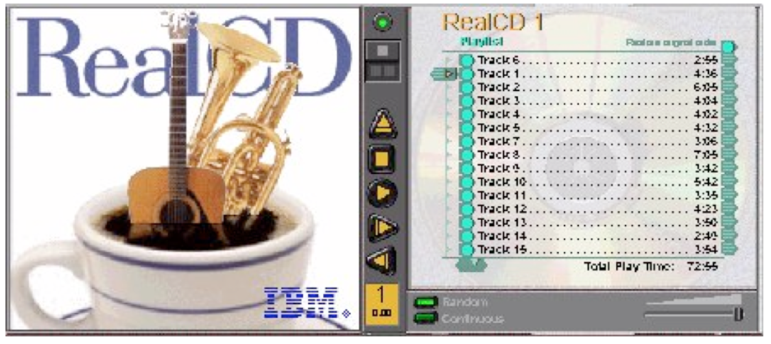
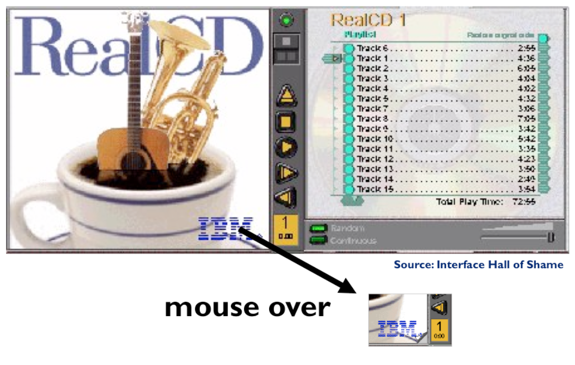
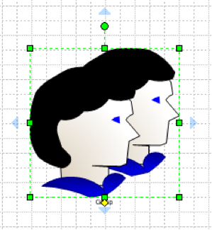
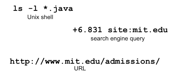
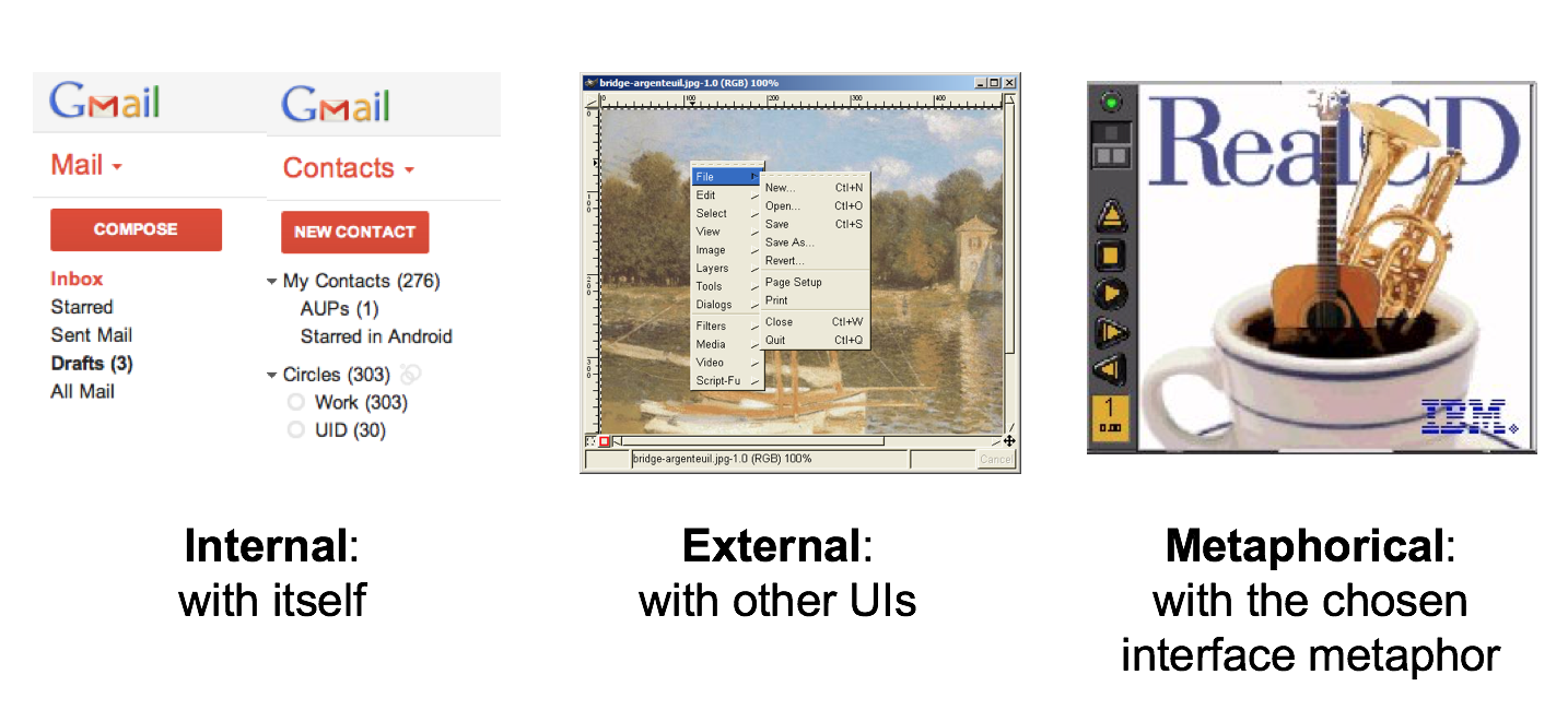
Metaphors are one way you can bring the real world into your interface. RealCD is an example of an interface that uses a strong metaphor in its interface.
A well-chosen, well-executed metaphor can be quite effective and appealing, but be aware that metaphors can also mislead.
The advantage of metaphor is that you’re borrowing a conceptual model that the user already has experience with. A metaphor can convey a lot of knowledge about the interface model all at once. It’s a notebook. It’s a CD
case. It’s a desktop. It’s a trashcan.
Each of these metaphors carries along with it a lot of knowledge about the parts, their purposes, and their interactions, which the user can draw on to make guesses about how the interface will work.
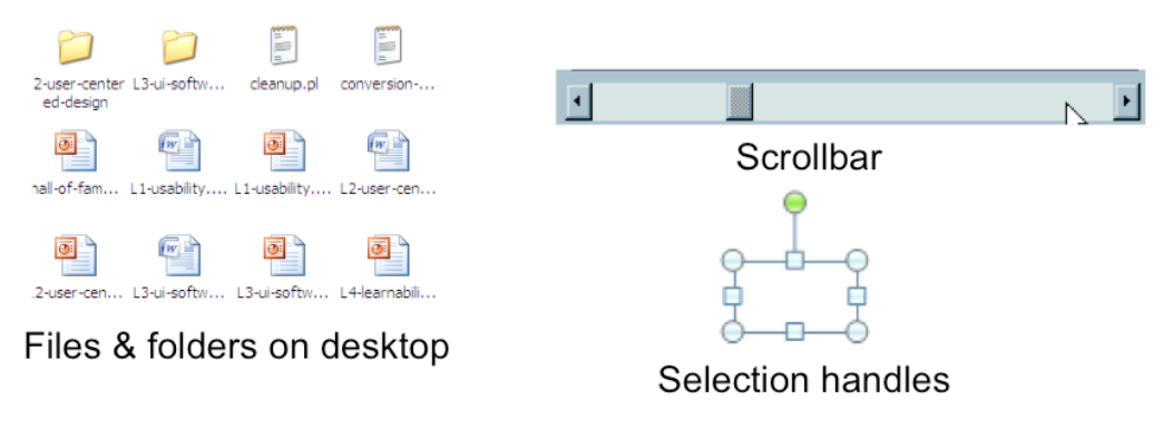
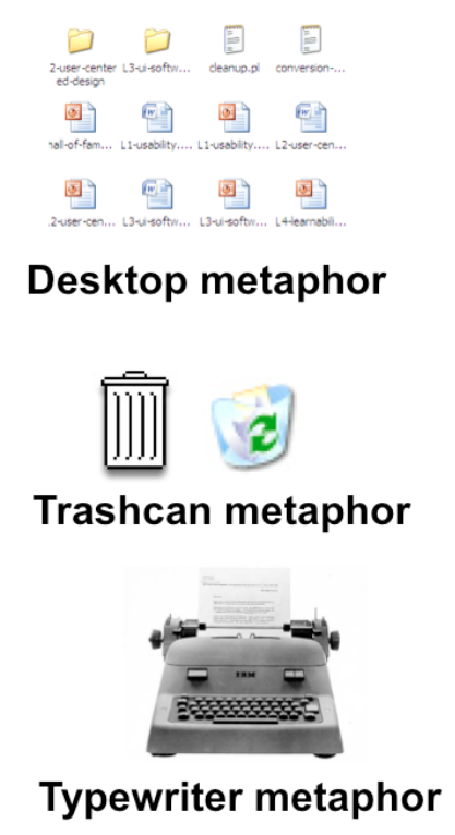
Some interface metaphors are famous and largely successful. The desktop metaphor – documents, folders, and overlapping paperlike windows on a desk-like surface – is widely used and copied. The trashcan, a place for discarding things but
also for digging around and bringing them back, is another effective metaphor – so much so that Apple defended its trashcan with a lawsuit, and imitators are forced to use a different look. (Recycle Bin, anyone?)
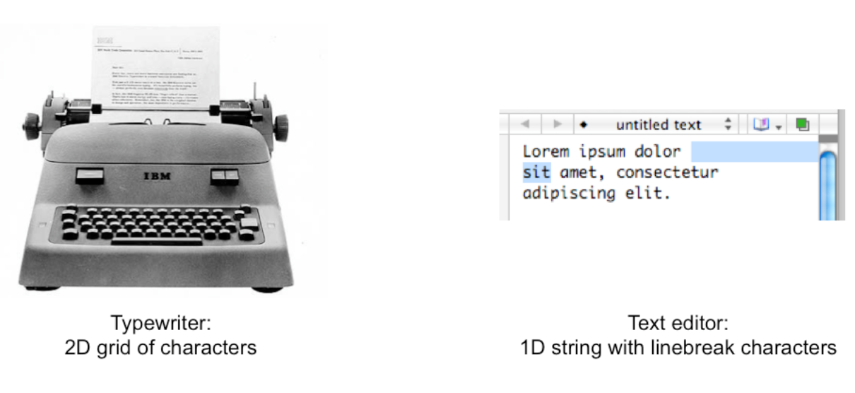
But a computer interface must deviate from the metaphor at some point – otherwise, why aren’t you just using the physical object instead? At those deviation points, the metaphor may do more harm than good. For example, it’s easy to say “a
word processor is like a typewriter,” but you shouldn’t really use it like a old-fashioned manual typewriter. Pressing Enter every time the cursor gets close to the right margin, as a typewriter demands, would wreak havoc with the word
processor’s automatic word-wrapping.
The basic rule for metaphors is: use it if you have one, but don’t stretch for one if you don’t.
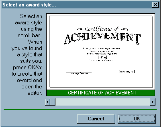
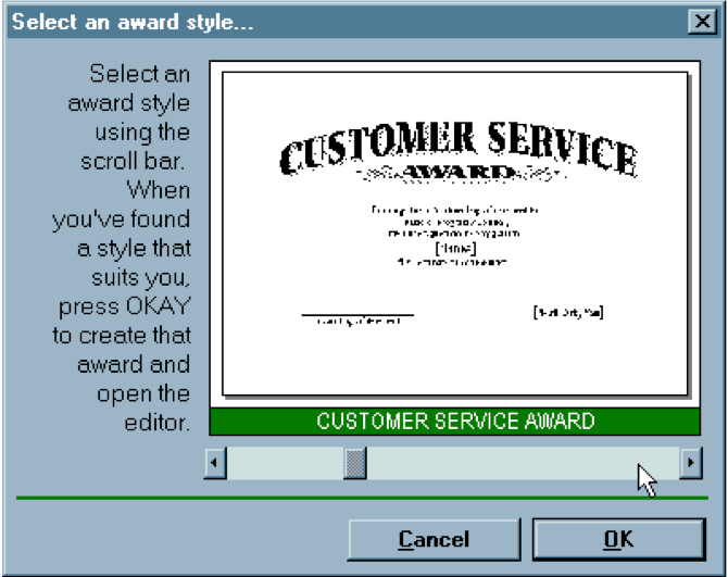
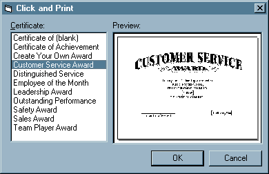
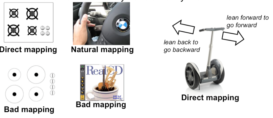
Appropriate metaphors can be very hard to find, particularly with real-world objects. The designers of RealCD stretched hard to use their CD-case metaphor (since in the real world, CD cases don’t even play CDs), and it didn’t work well.
Metaphors can also be deceptive, leading users to infer behavior that your interface doesn’t provide. Sure, it looks like a book, but can I write in the margin? Can I rip out a page?
Metaphors can also be constraining. Strict adherence to the desktop metaphor wouldn’t scale, because documents would always be full-size like they are in the real world, and folders wouldn’t be able to have arbitrarily deep nesting.
The biggest problem with metaphorical design is that your interface is presumably more capable than the real-world object, so at some point you have to break the metaphor. Nobody would use a word processor if really behaved like a
typewriter. Features like automatic word-wrapping break the typewriter metaphor, by creating a distinction between hard carriage returns and soft returns.
Most of all, using a metaphor doesn’t save an interface that does a bad job communicating itself to the user.
Although RealCD’s model was metaphorical – it opened like a CD case, and it had a liner notes booklet inside the cover – these features had such poor visibility and perceived affordances that they were ineffective.
 Grossman et al., A Survey of Software Learnability Metrics


 dragging
 can’t drop

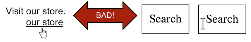
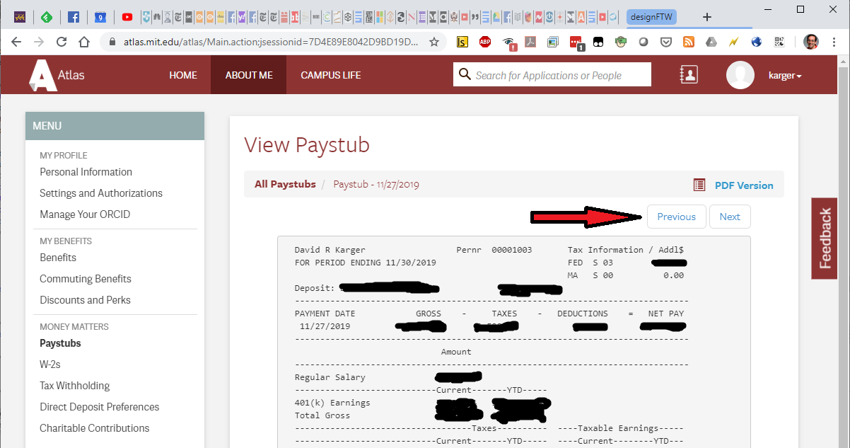 What does previous do here?


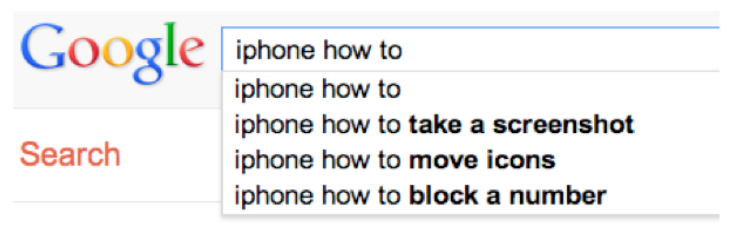 Adam Fourney, Richard Mann, and Michael Terry. “Characterizing the Usability of Interactive Applications Through Query Log Analysis.” CHI 2011