Lecture 10 Layout

Topics for today

Positioning

How do we break out of the flow and lay elements over others?

  • Positioning allows you to take elements out of the normal document layout flow, and make them behave differently, for example sitting on top of one another, or always remaining in the same place regardless of scrolling.
  • The position property controls which positioning scheme is used. Its initial value is static, which corresponds to the default document flow.
  • What do you notice when position: absolute is applied?
  • To control the element offsets, we use the top, right, bottom, left properties.
  • These are relative to the element’s containing block. By default, this is the initial containing block, a rectangle with the same dimensions as the viewport, anchored to the top of the document.

Terminology
Positioned element is any element with position != static

Use the offset properties to control the placement of positioned elements

A relatively positioned element still occupies the same space but can be moved with offset properties

position: absolute takes elements out of normal flow and places them over everything else

Any positioned element is a containing block of any positioned descendants
= that's where top, right, bottom, left count from

Read more about the containing block on MDN
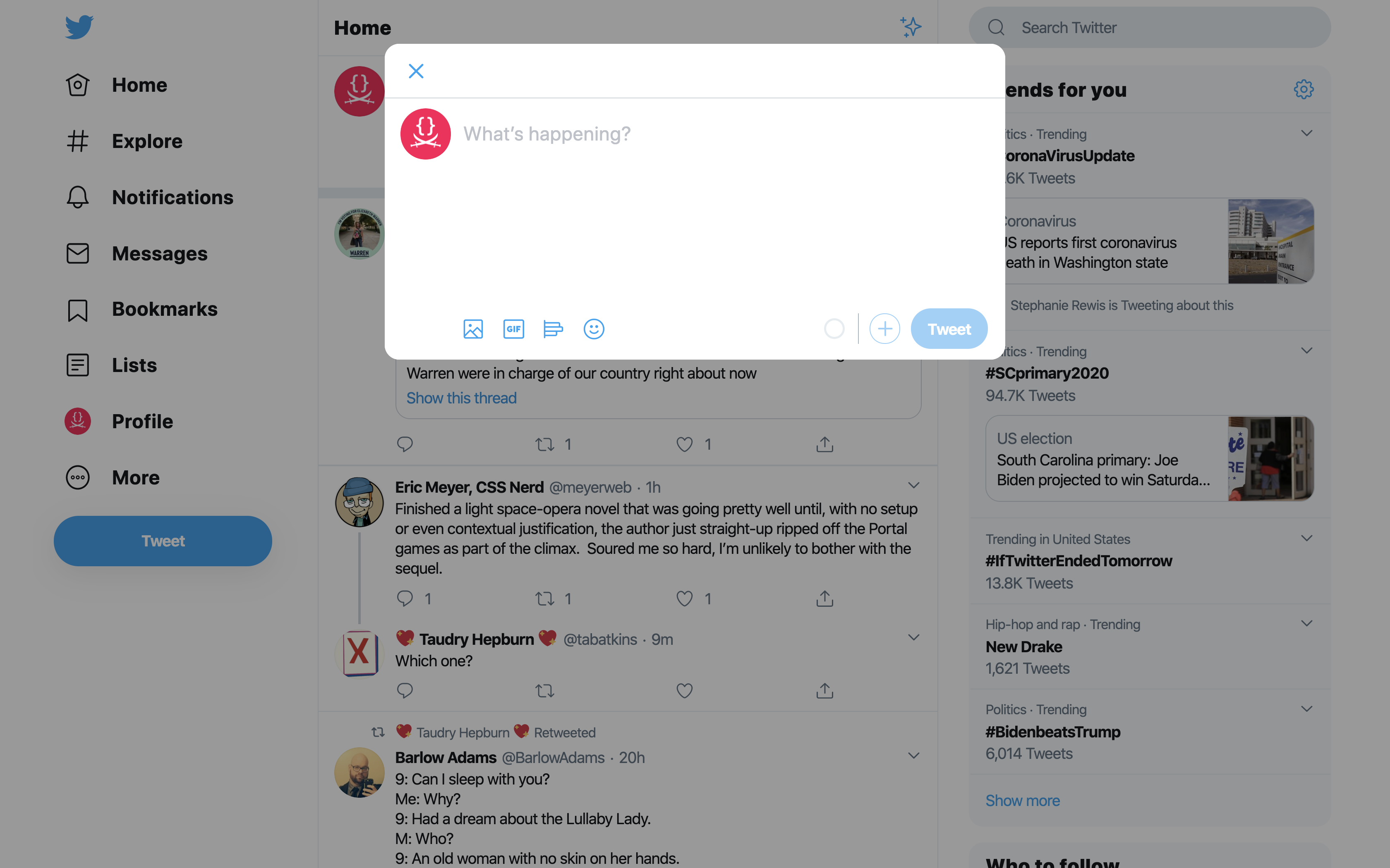
  • Can we center the absolutely positioned dialog in the viewport? Let's try top: 50%; left: 50%;. What happens?
  • z-index controls which element is on top of what. Its initial value is auto which corresponds to source order.
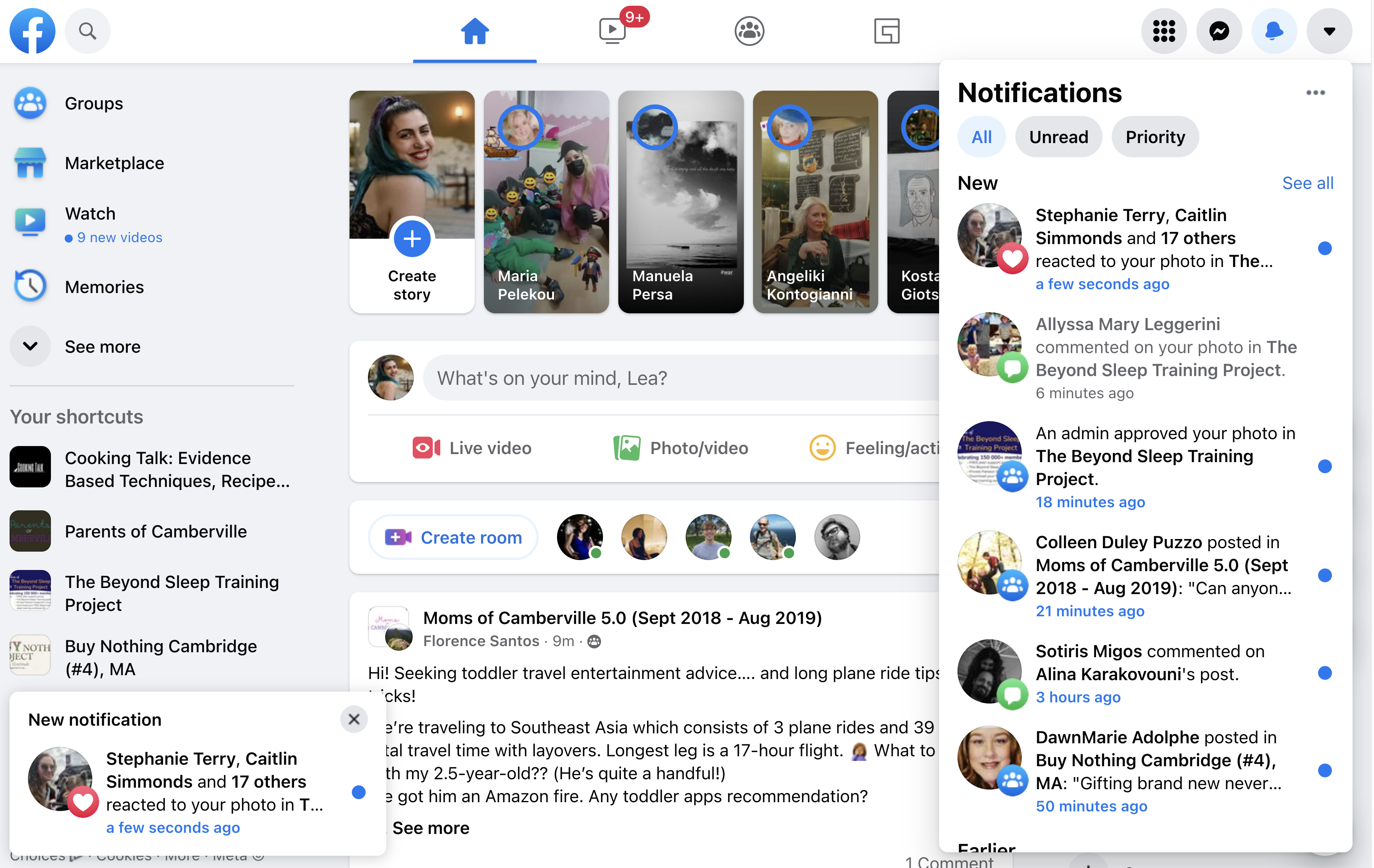
  • Note that when we scroll the notice moves. What if we want it to stay in the same place?
  • position: fixed to the rescue! It's just like absolute but the containing block is the viewport. This has the effect of the element staying in the same place during scrolling.

position: fixed allows us to position elements in the same place regardless of scrolling

  • position: sticky is a hybrid of relative and fixed:
    • If the element is in view, it behaves like relative.
    • If the element is not in view (the user has scrolled), but its containing block is, it behaves like fixed
    • If its parent gets out of view as well, it behaves like relative again
  • Note that position:sticky doesn't do anything by itself, you also need offsets!
  • What happens with horizontal scrolling?

position: sticky makes elements stay in the viewport for as long as their ancestors

When learning CSS, the precision of absolute positioning may be tempting, but avoid it: It will bite you back later, when you need to make changes!

Do not use absolute positioning to avoid figuring out layout: it will bite you back!

Floats

  • The float property removes an element from normal flow and sticks it to the left (or right) side of its parent container. Any content that comes below the floated element in the normal layout flow will now wrap around it, filling up the space to the right-hand side of it as far up as the top of the floated element.
  • While we can add a margin to the float to push the text away, we can't add a margin to the text to move it away from the float.
  • This is because a floated element is taken out of normal flow, and the boxes of the following items actually run behind the float, as we can see by applying backgrounds.
  • How could we make this layout more visually interesting and alternate floating the images left and right?

Floats push an element to the left or right and flow the rest of the content around it

Problems with floats
  • What happens when all the floated images are staggered together?
  • What happens when there is not enough content to flow around the entire vertical edge?
    • Can we move the last image upwards?
    • clear: both can help with the footer, but is not ideal (try adding some top margin…)

These crude tools (float & clear) were how CSS layouts were done until ~2015!
🤭🤢🤯

One dimensional layout

Layout that consists of putting things next to each other is everywhere!
  • display: flex enables Flexbox layout on an element. This element becomes the Flex Container and its children are called Flex Items.
  • flex: N defines the proportion that a flex item spreads over.
  • flex-direction: column on the flex container makes the items flow from top to bottom
  • align-items and justify-content on the flex container specify alignment in each direction. Which direction depends on the value of flex-direction
  • Flexbox concepts
    Flex container Flex item

    Main axis
    Cross axis
    One
    Two
    Three
    flex-flow: row
    Cross axis
    Main axis
    One
    Two
    Three
    flex-flow: column

    When elements are laid out as flex items, they are laid out along two axes:

    • The main axis is the axis running in the direction the flex items are laid out in (for example, as rows across the page, or columns down the page.) The start and end of this axis are called the main start and main end.
    • The cross axis is the axis running perpendicular to the direction the flex items are laid out in. The start and end of this axis are called the cross start and cross end.
    • The parent element that has display: flex set on it is called the flex container.
    • The items laid out as flexible boxes inside the flex container are called flex items

    Flexbox concepts: alignment

    Main axis
    Cross axis
    One
    Two
    Three
    flex-direction: row; align-items: center; justify-content: center;
    Cross axis
    Main axis
    One
    Two
    Three
    flex-direction: column; align-items: [align_items]; justify-content: [justify_content];

    Flexbox

  • Let's lay out this header horizontally
  • display: flex enables Flexbox layout on an element. This element becomes the Flex Container and its children are called Flex Items.
  • flex: N defines the proportion that a flex item spreads over.
  • flex-direction: column on the flex container makes the items flow from top to bottom
  • align-items and justify-content on the flex container specify alignment in each direction. Which direction depends on the value of flex-direction
  • Hands-on time!

    You may find useful: display gap flex align-items :focus-within

    Save your codepen and submit to

    Finished early? Experiment with the rest of the styling, change the logo, the menu items, go crazy!
    • display: contents hides an element's box (and thus if the element is a flex item, it makes its children flex items) but still displays its descendants.

    Elements with display: contents do not render their own box, but do render their descendants’ boxes

    Corollary: If inside a flex container, their children become flex items instead of themselves

    MultiCol Layout
    • Multiple Column Layout is another type of single-dimensional layout mode.
    • It is activated by using columns, column-count, or column-width
    • gap allows you to control spacing between columns
    • column-rule allows you to add lines between columns. Its syntax is similar to border.

    Multicol is not only about text, it can be used to lay out any element

    Grid Systems

    In graphic design, as in architecture, the guts of a finished product are held up by an underlying support structure that—more often than not—is invisible to the viewer, but can just as easily make or break a design.

    Grids are everywhere

    Which design principles does a grid facilitate?

    On the Web, grids must be flexible

    How do we implement grids with CSS?

    Grid Layout
    • display: grid enables Grid layout on an element. This element becomes the Grid Container and its children are called Grid Items.
    • display: grid doesn’t do much on its own, you also have to define the Grid template. There is a number of properties to do that, such as:
      • grid-template-rows
      • grid-template-columns
      • grid-template
      • …and many more
    • The 1fr unit allows us to distribute the available space in fractions without having to do any math with percentages.
    • The gap property allows us to set spacing between the grid cells.
    • The grid-row and grid-column properties allow us to place items on specific rows and/or columns. Note that multiple items can be placed in the same cell, and then they will overlap!

    Some terminology…

    Grid cell

    A single unit of a CSS grid

    Grid Lines

    The vertical and horizontal lines that divide the grid and separate the columns and rows.

    Grid area

    Rectangular space surrounded by four grid lines. A grid area can contain any number of grid cells.

    Grid track

    The space between two grid lines.

    Grid track

    This space can be horizontal or vertical

    Grid row

    A horizontal track of a grid

    Grid column

    A vertical track of a grid.

    Gutter

    The space between rows and columns in a grid

    Grid Container

    The element with display: grid

    Grid Item

    Any element that is a direct child of a grid container

    -->
    Grid Layout
    • Defining named areas is another way to specify a grid.
    • grid-area allows you to assign an element to a named area.
    • Then, rearranging elements on the grid is just a matter of editing the grid template!
    • The repeat allows us to create multiple columns or rows with the same metrics
    • Replaced elements with intrinsic dimensions still retain them in grid layout, unless set otherwise
    • grid-row-end and grid-column-end allow us to make elements span multiple grid cells without explicit control of which grid cells they fall on.
    • The dense keyword in grid-auto-flow prevents holes
    • Similarly to Flexbox, display:contents allows us to make descendants grid children
    • Text nodes are grid items too!