Lecture 9 Heuristic Evaluation & User Centered Design

UI Hall of Fame or Shame?

Outline

Usability Heuristics

Usability Heuristics (“Guidelines”)

What are they?
  • Rules that distill principles of effective UIs
  • Usually, but not always correct
    • Recognizing when to follow/ignore takes practice/experience
  • Help designers choose design alternatives
  • Help evaluators find problems in interfaces ("heuristic evaluation")
Plenty to choose from
  • Learnability/Efficiency/Safety
  • Nielsen's 10 principles
  • Norman's rules from Design of Everyday Things
  • Tognazzini's 16 principles
  • Shneiderman's 8 golden rules
Same general ideas, organized differently.

To understand the technique, we should start by defining what we mean by a usability heuristic or guideline. Heuristics, or usability guidelines, are rules that distill out the principles of effective user interfaces. There are plenty of sets of guidelines to choose from - sometimes it seems like every usability researcher has their own set of heuristics. Most of these guidelines overlap in important ways, however. The experts don't disagree about what constitutes good UI. They just disagree about how to organize what we know into a small set of operational rules.

Heuristics can be used in two ways: during design, to help you choose among alternative designs; and during heuristic evaluation, to find and justify problems in interfaces.

Principles from This Course

To help relate these heuristics to what you already know, here are the high-level principles that have organized our readings.

Nielsen Heuristics

  1. Match the real world (L)
  2. Consistency & standards (L)
  3. Help & documentation (L)
  4. User control & freedom (S)
  5. Visibility of system status (S)
  6. Flexibility & efficiency (E)
  7. Error prevention (S)
  8. Recognition, not recall (S)
  9. Error reporting, diagnosis, and recovery (S)
  10. Aesthetic & minimalist design

Jakob Nielsen, who invented the technique we're talking about, has 10 heuristics. (An older version of the same heuristics, with different names but similar content, can be found in his Usability Engineering book, one of the recommended books for designerss.)

We've talked about all of these in previous design principles reading (the particular reading is marked by a letter, e.g. L for Learnability).

Match System and Real World (Metaphor)

Library and Store

Consistency and Standards

Gmail adopted standard folder names
Consistent Word/Excel/Powerpoint toolbars

User Control and Freedom

Execute or Cancel
Breadcrumb navigation
Save or cancel edit
Undo/Redo buttons and hotkeys

Visibility of System Status (Feedback)

Progress bar while loading
Upload button becomes progress bar
Feedback message
Password strength continuously updates

Efficiency

Hotkey shortcuts (and self disclosure)
Common functions previewed

Error prevention

Yelp disables button after update
Primary action dominant
Auto suggest avoids mis-spellings
Auto-focus avoids missed keystrokes

Recognition over Recall

Type ahead completes terms
Show fonts in menu

Error Recovery

Feedback with instructions
Suggest alternatives

Aesthetics/Graphic Design

Contrasting labels, Repeating color, Aligned text, Tags set apart (Proximity)
Padded cells, differentiated header/footer

Norman Principles

We've also talked about some design guidelines proposed by Don Norman: visibility, affordances, natural mapping, and feedback (all in the Learnability reading).

Shneiderman's 8 Golden Rules

  1. Consistency
  2. Universal Usability
  3. Feedback
  4. Dialog closure
  5. Prevent and repair with Errors
  6. Reversible actions
  7. Keep user in control
  8. Reduce short-term memory load

Finally we have Shneiderman's 8 Golden Rules of UI design, which include most of the principles we've already discussed.

Consistency

Universal Usability

Feedback

Dialogs with Closure

Prevent Errors

Reversibile Actions

User Control

Reduce Memory Load

Tog's First Principles

  1. Aesthetics
  2. Anticipation
  3. Autonomy (control)
  4. Color
  5. Consistency
  6. Defaults
  7. Discoverability
  8. Efficiency
  9. Explorable interfaces
  10. Fitts's Law
  1. Human interface objects
  2. Latency reduction (feedback)
  3. Learnability
  4. Metaphors
  5. Protect users' work
  6. Readability
  7. Simplicity
  8. Track state
  9. Visible navigation

Another good list is Tog's First Principles, 16 principles from Bruce Tognazzini. We've seen most of these in previous readings. Here are the ones we haven't discussed (as such):

Autonomy
user is in control.
Human interface objects
another way of saying direct manipulation: onscreen objects should be continuously perceivable, and manipulable by physical actions
.
Latency reduction
minimize response time and give appropriate feedback for slow operations.

Heuristic Evaluation

Heuristic Evaluation

Heuristic evaluation is a usability inspection process originally invented by Nielsen. Nielsen has done a number of studies to evaluate its effectiveness. Those studies have shown that heuristic evaluation's cost-benefit ratio is quite favorable; the cost per problem of finding usability problems in an interface is generally cheaper than alternative methods.

Heuristic evaluation is an inspection method. It is performed by a usability expert - someone who knows and understands the heuristics we've just discussed, and has used and thought about lots of interfaces.

The basic steps are simple: the evaluator inspects the user interface thoroughly, judges the interface on the basis of the heuristics we've just discussed, and makes a list of the usability problems found - the ways in which individual elements of the interface deviate from the usability heuristics.

The Hall of Fame and Hall of Shame discussions we have at the beginning of each class are informal heuristic evaluations. In particular, if you look back at previous readings, you'll see that many of the usability problems identified in the Hall of Fame & Shame are justified by appealing to a heuristic.

How To Do Heuristic Evaluation

Let's look at heuristic evaluation from the evaluator's perspective. That's the role you'll be adopting in the next homework, when you'll serve as heuristic evaluators for each others' computer prototypes.

Here are some tips for doing a good heuristic evaluation. First, your evaluation should be grounded in known usability guidelines. You should justify each problem you list by appealing to a heuristic, and explaining how the heuristic is violated. This practice helps you focus on usability and not on other system properties, like functionality or security. It also removes some of the subjectivity involved in inspections. You can't just say "that's an ugly yellow color"; you have to justify why this is a usability problem that's likely to affect *usability* for other people.

List every problem you find. If a button has several problems with it - inconsistent placement, bad color combination, bad information scent - then each of those problems should be listed separately. Some of the problems may be more severe than others, and some may be easier to fix than others. It's best to get all the problems on the table in order to make these tradeoffs.

Inspect the interface at least twice. The first time you'll get an overview and a feel for the system. The second time, you should focus carefully on individual elements of the interface, one at a time.

Finally, although you have to justify every problem with a guideline, you don't have to limit yourself to the Nielsen 10. We've seen a number of specific usability principles that can serve equally well: affordances, visibility, Fitts's Law, perceptual fusion, color guidelines, graphic design rules are a few. The Nielsen 10 are helpful in that they're a short list that covers a wide spectrum of usability problems. For each element of the interface, you can quickly look down the Nielsen list to guide your thinking. You can also use the 6 high-level principles we've discussed (learnability, visibility, user control, errors, efficiency, graphic design) to help spur your thinking.

In Class

Nielsen Heuristics

  1. Match the real world (L)
  2. Consistency & standards (L)
  3. Help & documentation (L)
  4. User control & freedom (S)
  5. Visibility of system status (S)
  6. Flexibility & efficiency (E)
  7. Error prevention (S)
  8. Recognition, not recall (S)
  9. Error reporting, diagnosis, and recovery (S)
  10. Aesthetic & minimalist design

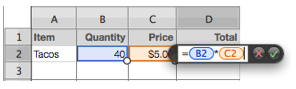
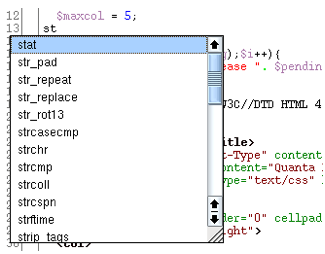
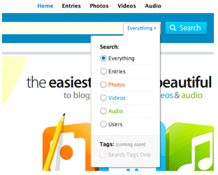
Let's try it on an example. Here's a screenshot of part of a web page (an intentionally bad interface). A partial heuristic evaluation of the screen is shown below. Can you find any other usability issues?

  1. Shopping cart icon is not balanced with its background whitespace (graphic design)
  2. Good: user is greeted by name (feedback)
  3. Red is used both for help messages and for error messages (consistency, match real world)
  4. "There is a problem with your order", but no explanation or suggestions for resolution (error reporting)
  5. ExtPrice and UnitPrice are strange labels (match real world)
  6. Remove Hardware button inconsistent with Remove checkbox (consistency)
  7. "Click here" is unnecessary (minimalist)
  8. No "Continue shopping" button (user control & freedom)
  9. Recalculate is very close to Clear Cart (error prevention)
  10. "Check Out" button doesn't look like other buttons (consistency, both internal & external)
  11. Uses "Cart Title" and "Cart Name" for the same concept (consistency)
  12. Must recall and type in cart title to load (recognition not recall, error prevention, efficiency)

Formalization

Formal Evaluation Process

  1. Training
    • Meeting for design team & evaluators
    • Introduce application
    • Explain user population, domain, scenarios
  2. Evaluation
    • Evaluators work separately
    • Generate written report, or oral comments recorded by an observer
    • Focus on generating problems, not on ranking their severity yet
    • 1-2 hours per evaluator
  3. Severity Rating
    • Evaluators prioritize all problems found (not just their own)
    • Take the mean of the evaluators' ratings
  4. Debriefing
    • Evaluators & design team discuss results, brainstorm solutions

Here's a formal process for performing heuristic evaluation. The training meeting brings together the design team with all the evaluators, and brings the evaluators up to speed on what they need to know about the application, its domain, its target users, and scenarios of use.

The evaluators then go off and evaluate the interface separately. They may work alone, writing down their own observations, or they may be observed by a member of the design team, who records their observations (and helps them through difficult parts of the interface, as we discussed earlier). In this stage, the evaluators focus just on generating problems, not on how important they are or how to solve them.

Next, all the problems found by all the evaluators are compiled into a single list, and the evaluators rate the severity of each problem. We'll see one possible severity scale in the next slide. Evaluators can assign severity ratings either independently or in a meeting together. Since studies have found that severity ratings from independent evaluators tend to have a large variance, it's best to collect severity ratings from several evaluators and take the mean to get a better estimate.

Finally, the design team and the evaluators meet again to discuss the results. This meeting offers a forum for brainstorming possible solutions, focusing on the most severe (highest priority) usability problems.

When you do heuristic evaluations in this class, I suggest you follow this ordering as well: first focus on generating as many usability problems as you can, then rank their severity, and then think about solutions.

Severity Ratings

Contributing factors

  • Frequency: how common?
  • Impact: how hard to overcome?
  • Persistence: how often to overcome?

Severity scale

  1. Cosmetic: need not be fixed
  2. Minor: needs fixing but low priority
  3. Major: needs fixing and high priority
  4. Catastrophic: imperative to fix

Here's one scale you can use to judge the severity of usability problems found by heuristic evaluation. It helps to think about the factors that contribute to the severity of a problem: its frequency of occurrence (common or rare); its impact on users (easy or hard to overcome), and its persistence (does it need to be overcome once or repeatedly). A problem that scores highly on several contributing factors should be rated more severe than another problem that isn't so common, hard to overcome, or persistent.

Writing Good Heuristic Evaluations

Here are some tips on writing good heuristic evaluations.

First, remember your audience: you're trying to communicate to developers. Don't expect them to be experts on usability, and keep in mind that they have some ego investment in the user interface. Don't be unnecessarily harsh.

Although the primary purpose of heuristic evaluation is to identify problems, positive comments can be valuable too. If some part of the design is *good* for usability reasons, you want to make sure that aspect doesn't disappear in future iterations.

Suggested Report Format

  • What to include:

    • Problem
    • Heuristic
    • Description
    • Severity
    • Recommendation (if any)
    • Screenshot (if helpful)

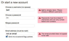
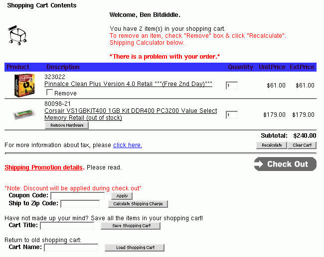
12 . Severe: User may close window without saving data (error prevention)

If the user has made changes without saving, and then closes the window using the Close button, rather than File ⟩⟩ Exit, no confirmation dialog appears.

Recommendation: show a confirmation dialog or save automatically

UI Hall of Fame or Shame?

A Detailed Evaluation

Students at UC Irvine evaluated Piazza through user testing, then redesigned it based on what they learned. Wrote it up in a Medium post.

Heuristic Evaluation Is Not User Testing

Heuristic evaluation is only one way to evaluate a user interface. User testing-watching users interact with the interface-is another. User testing is really the gold standard for usability evaluation. An interface has usability problems only if real users have real problems with it, and the only sure way to know is to watch and see.

A key reason why heuristic evaluation is different is that an evaluator is not a typical user either! They may be closer to a typical user, however, in the sense that they don't know the system model to the same degree that its designers do. And a good heuristic evaluator tries to think like a typical user. But an evaluator knows too much about user interfaces, and too much about usability, to respond like a typical user.

So heuristic evaluation is not the same as user testing. A useful analogy from software engineering is the difference between code inspection and testing.

Heuristic evaluation may find problems that user testing would miss (unless the user testing was extremely expensive and comprehensive). For example, heuristic evaluators can easily detect problems like inconsistent font styles, e.g. a sans-serif font in one part of the interface, and a serif font in another. Adapting to the inconsistency slows down users slightly, but only extensive user testing would reveal it. Similarly, a heuristic evaluation might notice that buttons along the edge of the screen are not taking proper advantage of the Fitts's Law benefits of the screen boundaries, but this problem might be hard to detect in user testing.

Evaluating Prototypes

A final advantage of heuristic evaluation that's worth noting: heuristic evaluation can be applied to interfaces in varying states of readiness, including unstable implementations, paper prototypes, and even just sketches. When you're evaluating an incomplete interface, however, you should be aware of one pitfall. When you're just inspecting a sketch, you're less likely to notice missing elements, like buttons or features essential to proceeding in a task. If you were actually *interacting* with an active prototype, essential missing pieces rear up as obstacles that prevent you from proceeding. With sketches, nothing prevents you from going on: you just turn the page. So you have to look harder for missing elements when you're heuristically evaluating static sketches or screenshots.

Hints for Better Heuristic Evaluation

Now let's look at heuristic evaluation from the designer's perspective. Assuming I've decided to use this technique to evaluate my interface, how do I get the most mileage out of it?

First, use more than one evaluator. Studies of heuristic evaluation have shown that no single evaluator can find all the usability problems, and some of the hardest usability problems are found by evaluators who find few problems overall (Nielsen, "Finding usability problems through heuristic evaluation", CHI '92). The more evaluators the better, but with diminishing returns: each additional evaluator finds fewer new problems. The sweet spot for cost-benefit, recommended by Nielsen based on his studies, is 3-5 evaluators.

One way to get the most out of heuristic evaluation is to alternate it with user testing in subsequent trips around the iterative design cycle. Each method finds different problems in an interface, and heuristic evaluation is almost always cheaper than user testing. Heuristic evaluation is particularly useful in the tight inner loops of the iterative design cycle, when prototypes are raw and low-fidelity, and cheap, fast iteration is a must.

In heuristic evaluation, it's OK to help the evaluator when they get stuck in a confusing interface. As long as the usability problems that led to the confusion have already been noted, an observer can help the evaluator get unstuck and proceed with evaluating the rest of the interface, saving valuable time. In user testing, this kind of personal help is totally inappropriate, because you want to see how a user would really behave if confronted with the interface in the real world, without the designer of the system present to guide them. In a user test, when the user gets stuck and can't figure out how to complete a task, you usually have to abandon the task and move on to another one.

Cognitive Walkthrough:
Another Inspection Technique

  • Expert inspection focused on learnability
  • Inputs:
    • prototype
    • task
    • sequence of actions to do the task in the prototype
    • user analysis
  • For each action, evaluator asks:
    • will user know what subgoal they want to achieve?
    • will user find the action in the interface?
    • will user recognize that it accomplishes the subgoal?
    • will user understand the feedback of the action?

Cognitive walkthrough is another kind of usability inspection technique. Unlike heuristic evaluation, which is general, a cognitive walkthrough is particularly focused on evaluating learnability - determining whether an interface supports learning how to do a task by exploration.

In addition to the inputs given to a heuristic evaluation (a prototype, typical tasks, and user profile), a cognitive walkthrough also needs an explicit sequence of actions that would perform each task. This establishes the *path* that the walkthrough process follows. The overall goal of the process is to determine whether this is an easy path for users to discover on their own.

Where heuristic evaluation is focusing on individual elements in the interface, a cognitive walkthrough focuses on individual actions in the sequence, asking a number of questions about the learnability of each action.

  • Will user try to achieve the right subgoal? For example, suppose the interface is an e-commerce web site, and the overall goal of the task is to create a wish list. The first action is actually to sign up for an account with the site. Will users realize that? (They might if they're familiar with the way wish lists work on other site; or if the site displays a message telling them to do so; or if they try to invoke the Create Wish List action and the system directs them to register first.)
  • Will the user find the action in the interface? This question deals with visibility, navigation, and labeling of actions.
  • Will the user recognize that the action accomplishes their subgoal? This question addresses whether action labels and descriptions match the user's mental model and vocabulary.
  • If the correct action was done, will the user understand its feedback? This question concerns visibility of system state - how does the user recognize that the desired subgoal was actually achieved.

Cognitive walkthrough is a more specialized inspection technique than heuristic evaluation, but if learnability is very important in your application, then a cognitive walkthrough can produce very detailed, useful feedback, very cheaply.

User Centered Design

User-Centered Design

Traditional Software Engineering Process: Waterfall Model

Let's contrast the iterative design process against another way. The waterfall model was one of the earliest carefully-articulated design processes for software development. It models the design process as a sequence of stages. Each stage results in a concrete product - a requirements document, a design, a set of coded modules - that feeds into the next stage. Each stage also includes its own validation: the design is validated against the requirements, the code is validated (unit-tested) against the design, etc.

The biggest improvement of the waterfall model over previous (chaotic) approaches to software development is the discipline it puts on developers to think first, and code second. Requirements and designs generally precede the first line of code.

If you've taken a software engineering course, you've experienced this process yourself. The course staff probably handed you a set of requirements for the software you had to build --- e.g., the specification of a chat client or a pinball game. (In the real world, identifying these requirements would be part of your job as software developers.) You were then expected to meet certain milestones for each stage of your project, and each milestone had a concrete product: (1) a design document; (2) code modules that implemented certain functionality; (3) an integrated system.

Validation is not always sufficient; sometimes problems are missed until the next stage. Trying to code the design may reveal flaws in the design - e.g., that it can't be implemented in a way that meets the performance requirements. Trying to integrate may reveal bugs in the code that weren't exposed by unit tests. So the waterfall model implicitly needs feedback between stages.

The danger arises when a mistake in an early stage - such as a missing requirement - isn't discovered until a very late stage - like acceptance testing. Mistakes like this can force costly rework of the intervening stages. (That box labeled "Code" may look small, but you know from experience that it isn't!)

Waterfall Model Is Bad for UI Design

Although the waterfall model is useful for some kinds of software development, it's very poorly suited to user interface development.

First, UI development is inherently risky. UI design is hard for all the reasons we discussed in the first class. (You are not the user; the user is always right, except when the user isn't; users aren't designers either.) We don't (yet) have an easy way to predict whether a UI design will succeed.

Second, in the usual way that the waterfall model is applied, users appear in the process in only two places: requirements analysis and acceptance testing. Hopefully we asked the users what they needed at the beginning (requirements analysis), but then we code happily away and don't check back with the users until we're ready to present them with a finished system. So if we screwed up the design, the waterfall process won't tell us until the end.

Third, when UI problems arise, they often require dramatic fixes: new requirements or new design. We saw in Lecture 1 that slapping on patches doesn't fix serious usability problems.

Iterative Design

  • We won't get it right the first time
  • Evaluation will force re-design
  • Eventually, converge to good solution
  • Design guidelines help reduce number and cost of iterations
  • Isn't this just like a repeated waterfall?

Iterative design offers a way to manage the inherent risk in user interface design. In iterative design, the software is refined by repeated trips around a design cycle: first imagining it (design), then realizing it physically (implementation), then testing it (evaluation).

In other words, we have to admit to ourselves that we aren't going to get it right on the first try, and plan for it. Using the results of evaluation, we redesign the interface, build new prototypes, and do more evaluation. Eventually, hopefully, the process produces a sufficiently usable interface.

Sometimes you just iterate until you're satisfied or run out of time and resources, but a more principled approach is to set usability goals for your system. For example, an e-commerce web site might set a goal that users should be able to complete a purchase in less than 30 seconds.

Many of the techniques we'll learn in this course are optimizations for the iterative design process: design guidelines reduce the number of iterations by helping us make better designs; cheap prototypes and discount evaluation techniques reduce the cost of each iteration. But even more important than these techniques is the basic realization that in general, you won't get it right the first time. If you learn nothing else about user interfaces from this class, I hope you learn this.

You might object to this, though. At a high level, iterative design just looks like the worst-case waterfall model, where we made it all the way from design to acceptance testing before discovering a design flaw that *forced* us to repeat the process. Is iterative design just saying that we're going to have to repeat the waterfall over and over and over? What's the trick here?

Spiral Model

  • Know early iterations will be discarded
  • So make them cheap
  • Storyboards, sketches, mock-ups
  • Low-fidelity prototypes
  • Just detailed enough for evaluation

The spiral model offers a way out of the dilemma. We build room for several iterations into our design process, and we do it by making the early iterations as cheap as possible.

The radial dimension of the spiral model corresponds to the cost of the iteration step - or, equivalently, its fidelity or accuracy. For example, an early implementation might be a paper sketch or mockup. It's low fidelity, only a pale shadow of what it would look and behave like as interactive software. But it's incredibly cheap to make, and we can evaluate it by showing it to users and asking them questions about it.

Early Prototyping

Sketches

Paper Prototypes

Computer Mockups

Here are some examples of early-stage prototyping for graphical user interfaces. We'll talk about these techniques and more in a future prototyping lecture.

Early Prototypes Can Detect Usability Problems

  • Even a sketch would have revealed many usability problems
  • No need for an interactive implementation
Remember this Hall of Shame candidate from the first class? This dialog's design problems would have been easy to catch if it were only tested as a simple paper sketch, in an early iteration of a spiral design. At that point, changing the design would have cost only another sketch, instead of a day of coding.

Increasing Fidelity over Iterations

Iterative Design of User Interfaces

Why is the spiral model a good idea? Risk is greatest in the early iterations, when we know the least. So we put our least commitment into the early implementations. Early prototypes are made to be thrown away. If we find ourselves with several design alternatives, we can build multiple prototypes (parallel design) and evaluate them, without much expense. The end of this reading will make more arguments for the value of parallel design.

After we have evaluated and redesigned several times, we have (hopefully) learned enough to avoid making a major UI design error. Then we actually implement the UI - which is to say, we build a prototype that we intend to keep. Then we evaluate it again, and refine it further.

The more iterations we can make, the more refinements in the design are possible. We're hill-climbing here, not exploring the design space randomly. We keep the parts of the design that work, and redesign the parts that don't. So we should get a better design if we can do more iterations.

Case Study of User-Centered Design:
The Olympic Message System

  • Cheap prototypes
    • Scenarios
    • User guides
    • Simulation (Wizard of Oz)
    • Prototyping tools (IBM Voice Toolkit)
  • Iterative design
    • 200 (!) iterations for user guide
  • Evaluation at every step
  • You are not the user
    • Non-English speakers had trouble with alphabetic entry on telephone keypad

The Olympic Message System is a classic demonstration of the effectiveness of user-centered design (Gould et al, “The 1984 Olympic Message System”), CACM, v30 n9, Sept 1987). The OMS designers used a variety of cheap prototypes: scenarios (stories envisioning a user interacting with the system), manuals, and simulation (in which the experimenter read the system's prompts aloud, and the user typed responses into a terminal). All of these prototypes could be (and were) shown to users to solicit reactions and feedback.

Iteration was pursued aggressively. The user guide went through 200 iterations!

A video about OMS can be found on YouTube. Check it out---it includes a mime demonstrating the system.

The OMS also has some interesting cases reinforcing the point that the designers cannot rely entirely on themselves for evaluating usability. Most prompts requested numeric input ("press 1, 2, or 3"), but some prompts needed alphabetic entry ("enter your three-letter country code"). Non-English speakers - particularly from countries with non-Latin languages - found this confusing, because, as one athlete reported in an early field test, "you have to read the keys differently." The designers didn't remove the alphabetic prompts, but they did change the user guide's examples to use only uppercase letters, just like the telephone keys.

Summary

Discussion of Course