Lecture 4 Graphic Design

Topics for today

What & Why?

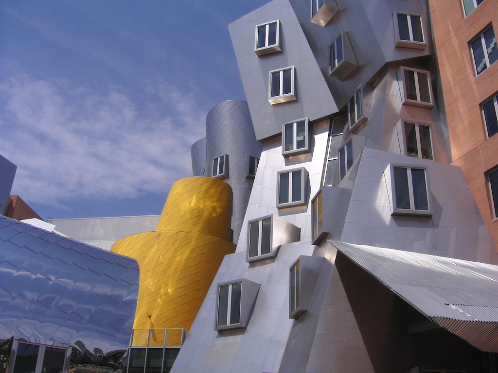
“Most people make the mistake of thinking design is what it looks like. People think it’s this veneer – that the designers are handed this box and told, ‘Make it look good!’ That’s not what we think design is. It’s not just what it looks like and feels like. Design is how it works.

Steve Jobs

[Source](https://www.nytimes.com/2003/11/30/magazine/the-guts-of-a-new-machine.html) This is about design in general, but the same goes for graphic design. Graphic design is not about prettifying (though aesthetics certainly matter too), and should be baked in, not an afterthought.
Nessie ladle with feet

Good design facilitates function

Bad design gets in the way

Good (form follows function) design examples: * Ramp and stairs co-existing in Robson square in Vancouver. ("stramp") In practice the ramp is too steep and has been criticized for it, but the idea itself is a beautiful combination of function, aesthetics, and inclusivity. [source](https://universaldesign.org/podcast/011-stramps) * Dieter Rams designs for Braun (mid to late 20th century). Dieter Rams' designs are iconic as he paved the way for the three F design approach, “Form Follows Function” which is instrumental to design today, even though he did not use that wording himself. Bad (form over function) design examples: * Clock with no demarcations for numbers, and hands so dark they are barely visible [source](https://www.allmodern.com/wall-decor-mirrors/pdp/schwoeppe-wall-clock-a000439740.html?piid=881386331%2C881386327%2C881386321) * Another incomprehensible clock [source](https://www.ashleysdeco.com/gs/1-1-96_E-A/Silent-extra-large-kitchen-vertical-modern-clock-for-wall-53-inch-yellow-black-and-.html) * The UI of modern iPhones has eliminated nearly all buttons for the sake of a sleek design, and navigation consists of a bunch of undiscoverable swipes [source](https://www.youtube.com/watch?v=UnSUuZwaVa8&t=26s) * Frank Gehry's Stata center is an example of form over function; MIT even sued him for it! [source](https://www.nytimes.com/2007/11/07/us/07mit.html) * The iconic Juicy Salif by Philippe Strack is incredibly famous, but as many have discovered, it is a very poor juicer. Philippe Starck himself said “It’s not meant to squeeze lemons, it is meant to start conversations” [source](https://medium.com/designstudies1/philippe-starcks-juicy-salif-lemon-squeezer-genius-design-or-just-a-cool-fruit-squeezer-d2b41634407c)
Juicy Salif Instruction manual
Further evidence that it is a poor lemon juicer is the fact that it comes with instructions…

Design != Art

Design is not art. Design needs to serve a purpose, whereas art is about expression. Designs have to solve problems, while art provokes thought and emotions. Art is perceptual, while a design is rational. Design that prioritizes aesthetics over functionality is poor design, but it could be great art!

Graphic Design can enhance
or hinder communication

Take a look at these two domains. The top one is using a typeface that is more appropriate for their message, and thus is enhancing communication. The bottom one is using a typeface that is associated with different things, making you seriously second-guess what kind of clowns these are and whether you'd want them anywhere near your kids!
Here is another example where graphic design hinders instead of enhances communication because the typography is fighting against the message. If you quickly glance at these bottles, what do you think these products are?

Aesthetic Usability Effect

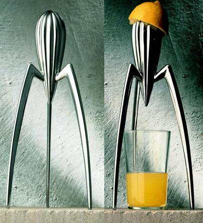
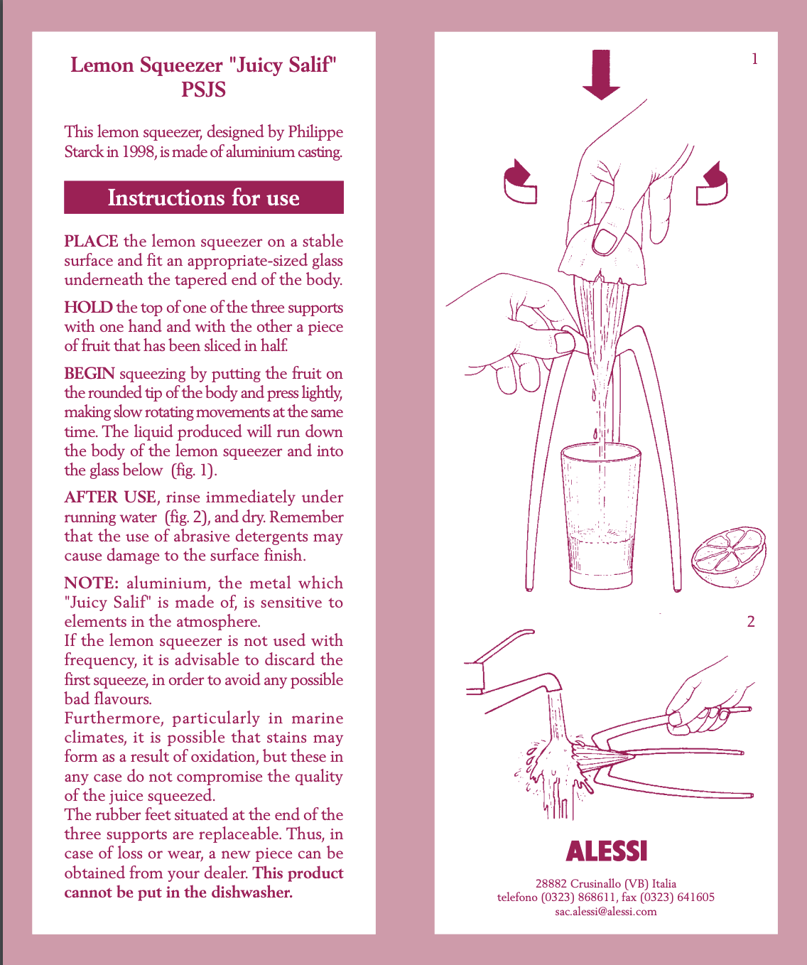
Users are more tolerant of minor usability issues when they find a UI visually appealing

  • Sources: Aesthetic Usability Effect
    During usability testing, one user encountered many issues while shopping on the FitBit site, ranging from minor annoyances in the interaction design to serious flaws in the navigation. She was able to complete her task, but with difficulty. However, in a posttask questionnaire, she rated the site very highly in ease of use. “It’s the colors they used,” she said. “Looks like the ocean, it’s calm. Very good photographs.” The positive emotional response caused by the aesthetic appeal of the site helped mask its usability issues.
  • In other words, users have a positive emotional response to your visual design, and that makes them more tolerant of minor usability issues on your site
  • Bear in mind that the aesthetic-usability effect has its limits. A pretty design can make users more forgiving of minor usability problems, but not of larger ones.

Design Principles

Design principles are “rules of thumb”; heuristics that help us make design decisions

Design Principles Appearing more than twice

Lots of overlap

Today, we are going to focus on the following:

Contrast

Make elements that are not the same, clearly different

The first principle we will talk about is *contrast*.

Why?

“For contrast to be effective, it needs to be strong. Don't be a wimp. You cannot contrast 12-point type with 14-point type. You cannot contrast a half-point rule with a one-point rule. You cannot contrast dark brown with black. Get serious.”

R. Williams

If two elements are sort of different, but not really, you don't have contrast, you have conflict

Sample Heading

Sample body text. Lorem Ipsum dolor sit amet.

Context is integral to contrast

  • We may think that the chosen visual object in a composition says something about itself but it is more often the visual elements around it that give it its meaning.
  • For example: Here is a simple circle. What is it saying about itself? Does it say how big or small it is? or how far away from us it is?
  • To suggest that, we need another visual element. So here is a smaller circle and by placing this new visual object next to the original circle we now create contrast by context.
  • But what if we bring in another circle the same size as the original but this time it’s darker. Well this may suggest that this circle is perhaps closer to us or more important and it certainly grabs our attention more.
  • Contrast creates interesting relationships between the visual elements. It can push elements away, connect them or complement them. Without contrast, visual elements can be meaningless.

Applying contrast: Type and Color

Scale

Lorem Ipsum dolor sit amet

Weight

Lorem Ipsum dolor sit amet

Color

Lorem Ipsum dolor sit amet

Serif vs sans serif

Lorem Ipsum dolor sit amet

Color

Lorem Ipsum dolor sit amet

Background

Lorem Ipsum dolor sit amet

Applying contrast: Line

The Rules of Life

  • Your attitude is your life.
  • Maximize your options.
  • Never take anything too seriously.
  • Don't let the seeds stop you from enjoyin' the watermelon.
  • Be nice.

The Rules of Life

  • Your attitude is your life.
  • Maximize your options.
  • Never take anything too seriously.
  • Don't let the seeds stop you from enjoyin' the watermelon.
  • Be nice.
  • There is a bit of contrast between the typefaces and between the rules. but the contrast is wimpy. Are the rules supposed to be two different thicknesses? Or is it a mistake?
  • Second box: Now the strong contrast between the typefaces makes the piece much more dynamic and eye-catching, with a stronger contrast between the thicknesses of the rules, there is no risk of someone thinking it's a mistake. The entire table is stronger and more sophisticated; you know where it begins and where it ends.
  • Example source: The Non-Designer's Design Book, Robin Williams

Contrasting multiple variables

Bold

Sample body text. Lorem Ipsum dolor sit amet.

Size

Sample body text. Lorem Ipsum dolor sit amet.

Color

Sample body text. Lorem Ipsum dolor sit amet.

Serif

Sample body text. Lorem Ipsum dolor sit amet.

All caps

Sample body text. Lorem Ipsum dolor sit amet.

Italics

Sample body text. Lorem Ipsum dolor sit amet.

  • More often than not, we need to vary multiple variables to create sufficient contrast
  • However, be wary because sometimes this can create a lack of unity.

Repetition

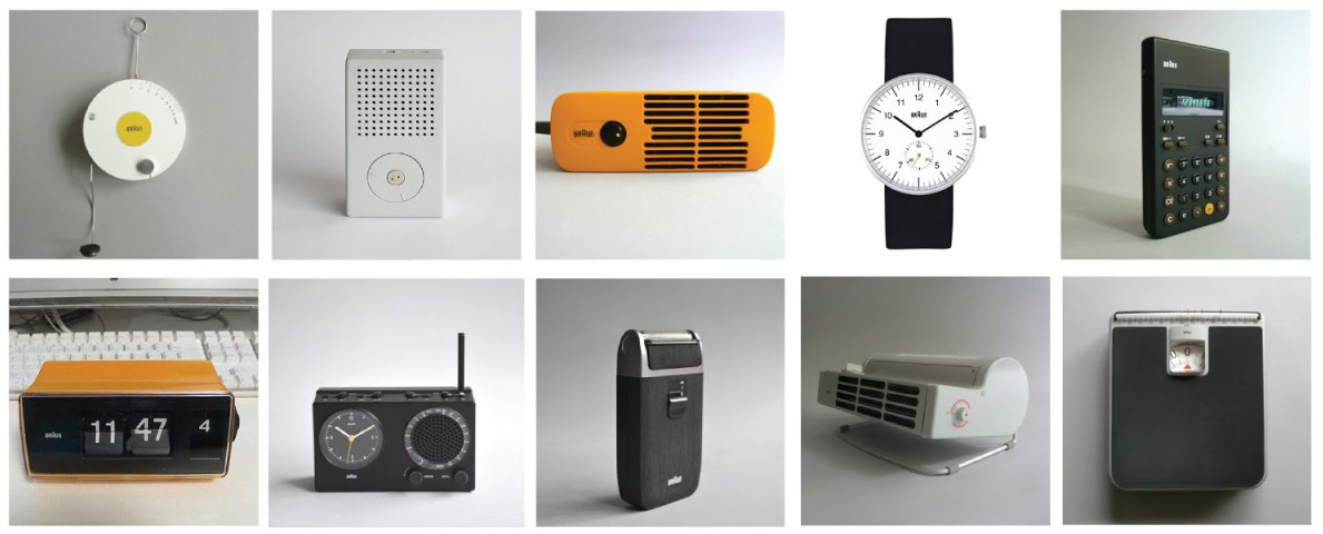
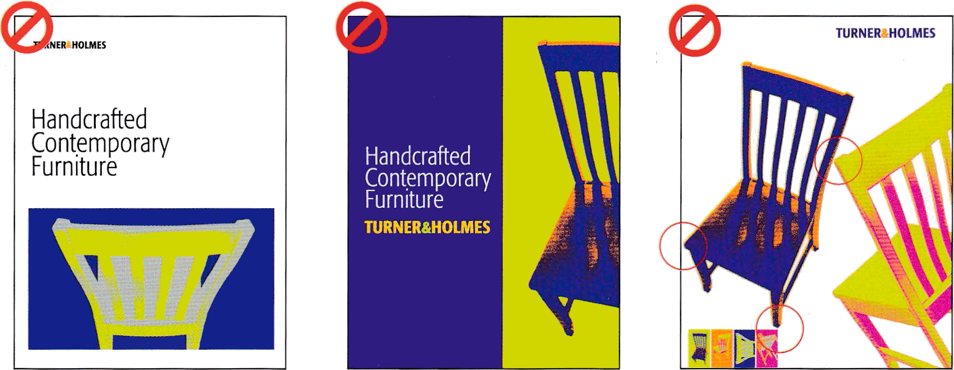
Repeat aspects of the design throughout the entire piece

Why?

Repetition creates unity, consistency, cohesiveness

Repetition in action

Let’s look at an example of how we can use different visual treatments to unify disparate elements. Take a look at these five photos. They have nothing in common! Different aspect ratios, different angles, colors, backgrounds, everything. This frequently happens when you're designing a website that lists people (e.g. a conference website), and everyone sends their own headshot. How to visually unify them with themselves and the rest of the design? We have many tools at our disposal, and they are all commonly used: we can crop them to the same aspect ratio, or even the same shape. We can colorize them with the same colors, or apply the same decoration (e.g. borders, shadows). Often many of these treatments are used together.

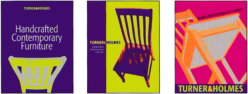
A detail from the logo is enlarged and repeated throughout the coroprate identity as a unifying design element. Furthermore, unity is achieved through repetition of the same colors, and typography.

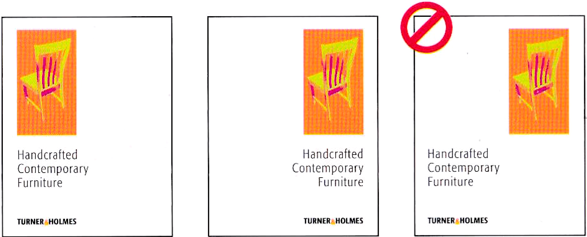
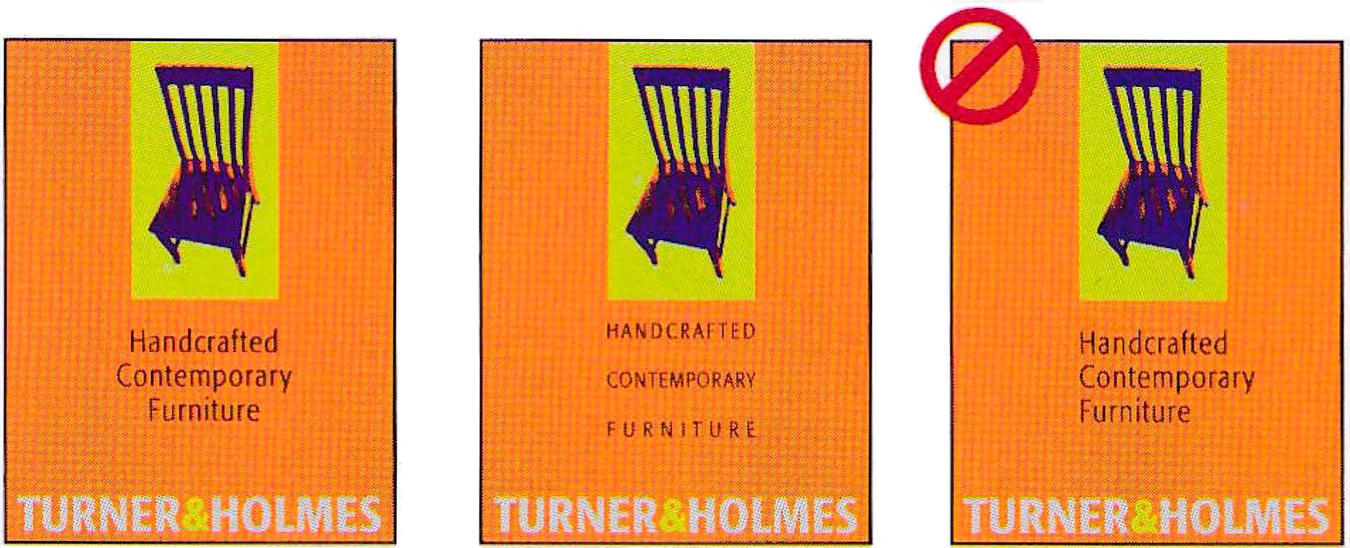
Notice how the logo silhouette and has been repeated throughout as a design element. The brand colors are also quite bold, and have been repeated in large areas throughout, which creates significant unity.

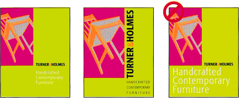
Notice how the logo is repeated as a background, much larger and with a different angle. This is a common technique for creating subtle repetition. What other types of repetition can you spot?

Be wary of too much repetition

Repeating some design elements unifies, repeating everything creates tiring, uninteresting designs. Think of classic PowerPoint templates where every slide has exactly the same design elements, and exactly the same bulleted lists with the main difference being the text. This is one reason why these are universally regarded as dull (“death by PowerPoint”).

In-class activity

Alignment

Nothing should be placed arbitrarily. Every item should have a visual connection with something else.

Why?

  • When items are aligned, the result is a stronger cohesive unit.
  • Even when aligned elements are physically separated from each other, there is an invisible line that connects them, both in your eye and in your mind.
  • Like repetition, alignment also allows you to connect spatially disconnected design elements
Flush-left: safe and sure. The result has a well organized, conservative feel.
Flush-right: Slightly less conventional and more dynamic.
Visual disagreement. The result feels scattered and unsure.

Source: Design Basics Index, Jim Krause

Centered alignment: A common and conventional approach
Justified alignment: Letterspacing as a creative typographic solution
Subtle violation. The result looks accidental.

Source: Design Basics Index, Jim Krause

Structure through association. The edges of various elements provide alignment cues for the placement of others.
Even a sideways logo and tipping chair feel securely anchored because of the strong, clear alignments.
Subtle discrepancy. Visual indecision weakens structure; avoid it!

Source: Design Basics Index, Jim Krause

A subtle strength. The legs of the chair provide a cue for the logo's width.
Taking advantage. The crux of angles in the chair image provide a strong focal point; an ideal position for the logo baseline.
Following an edge or a contour works too!

Source: Design Basics Index, Jim Krause

Flush left typography is paired with an image containing centred content.
Trapped space. The eye feels uneasy when it finds itself presented with no way out.
Elements with sharp contours that barely touch the edges create tension. Busy images in the corner of a layout tend to pull attention away from content.

Source: Design Basics Index, Jim Krause

Optical Alignment

A
B
Are these shapes aligned on both edges or is one smaller than the other?

Alignment

Optical alignment is very common in typeface design. For our eyes to see a straight line across the tops and bottoms of letters, there is a lot of manual nudging above and below that line. For example, curved characters, like O and e are always a little bigger, to trick our eyes into thinking they are the same as their boxier siblings.

Visual weight

Just like our eyes fool us when it comes to size, they also fool us when it comes to alignment. Which of those triangles is actually centered within its circle? The reason this happens is that our eyes do not perceive the straight and the pointy edge in the same way. We don't see the rectangular bounding box around the triangle, we see the space around it, and there is a lot more space on the right than the left, so we need to nudge it to the right to counter that and make it actually look centered.
One more example. Which of these looks like it has equal spacing around between the text and the edges of the rectangle on all sides?

Design for humans, not computers

Nobody cares if your design elements are perfectly aligned mathematically. What matters is how the human eye sees them. If they are not aligned to the human eye, you do not get the benefits of alignment. Note that some design tools are sophisticated enough to help you with optical alignment, but most are rather dumb and only pay attention to each shape's rectangular bounding box, so you need to help them along.

Proximity

Elements should be close together iff they are logically connected

Haystack Group
David Karger
(505) 555-1212
32 Vassar Street
Cambridge, MA

Take a look at this typical business card layout, below. How many separate elements do you see in that small space? That is, how many times does your eye stop to look at something?

  • Does your eye stop five times? Of course—there are five separate items on this little card.
  • Where do you begin reading? In the middle, probably, because that phrase is boldest.
  • What do you read next—do your eyes move left to right?
  • What happens when you get to the bottom-right corner, where does your eye go?
  • Do you wander around making sure you didn’t miss any corners?
Haystack Group
David Karger
32 Vassar Street
Cambridge, MA
(505) 555-1212

And what if we confuse the issue even further:

  • Now that there are two bold phrases, where do you begin? Do you start in the upper left? Do you start in the center?
  • After you read those two items, where do you go? Perhaps you bounce back and forth between the words in bold, nervously trying to also catch the words in the corners.
  • Do you know when you’re finished?

Why?

Haystack Group
David Karger
(505) 555-1212
32 Vassar Street
Cambridge, MA

Now is there any question about where you begin to read the card? Where do your eyes go next? Do you know when you’re finished? With that one simple concept, this card is now organized both intellectually and visually. And thus it communicates more clearly.

Correspondences Flowers, herbs, trees Ancient Greeks and Romans Historical characters Quotes on motifs Women Death Morning Snakes Language Iambic pentameter Rhetorical devices Poetic devices First lines Collections Small printings Kitschy Dingbats
  • In this list, everything is close to everything else, so it is difficult to see the relationships or the organization even with the headings in bold.
  • The same list has been visually separated into groups by adding a little space between each set.
  • I’m sure you already do this automatically—I’m just suggesting that you now do it consciously and thus with more strength.
  • Nine Dots
    1. Nine dots, casually arranged with no obvious association between them.
    2. Nine dots, clearly associated, but what if we want to show that three of the dots do not belong with the others?
    3. Here three dots grouped and separated from the others. It's almost as though there's a story forming in this sample…
    Why is this design so difficult to read? Note that most adults of Western backgrounds have been trained to read left to right for decades. If you want them to read top to bottom instead, you need to use considerably closer proximity between rows compared to columns. Here rows and columns are of approximately equal distance, so our eyes try to read horizontally, and the result makes no sense. Furthermore, the secondary grouping introduced through the colors is meaningless.
    Here is a similar design idea done right. The grouping introduced by the colors introduces alternative words, making it a playful, clever design.

    Simplicity

    “Perfection is achieved, not when there is nothing more to add, but when there is nothing left to take away”

    Antoine de Saint-Exupéry, Airman's Odyssey

    Unfortunately, the Anova design also suffers from extreme simplicity that ends up being form over function: to minimize controls, the timer function (which is essential for sous vide) is a mysterious sequence of arbitrary short and long button presses. Thankfully, this has been fixed in recent models.

    Not simple enough or too simple? Which one is better?

    Not simple enough or too simple? Which one is better?

    Can we simplify this while preserving the same amount of information?

    Is this a good idea?

    Once you understand design principles, you know when to break them