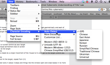
Lecture 5 Efficiency

Example

Internet Explorer

Deleting a Cookie File

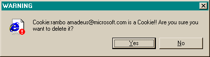
This message used to appear when you tried to delete the contents of your Internet Explorer cache from inside Windows Explorer (i.e., you browse to the cache directory, select a file containing one of IE’s browser cookies, and delete it).

Put aside the fact that the message is almost tautological (“Cookie… is a Cookie”) and overexcited (“!!”).

Does it give the user enough information to make a decision?

Deleting Multiple Cookies

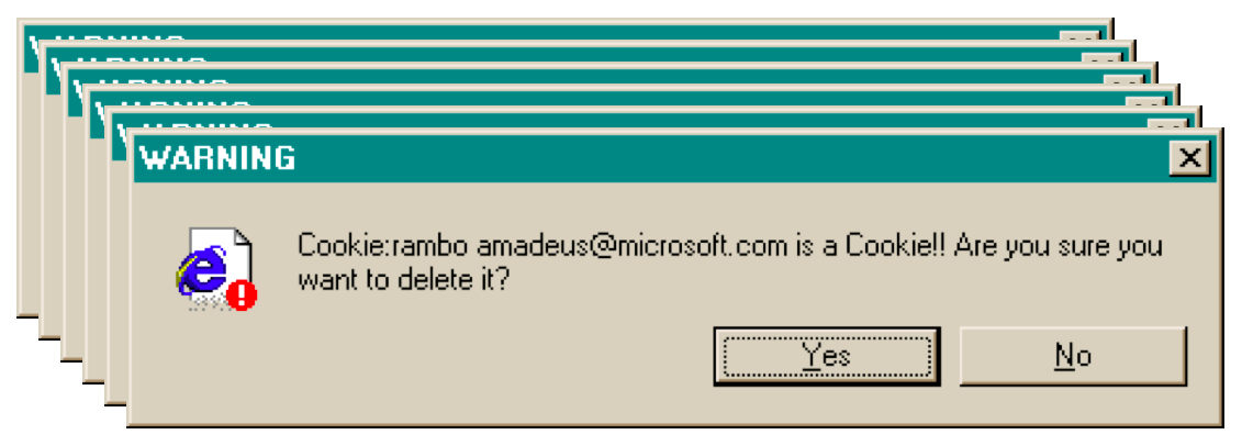
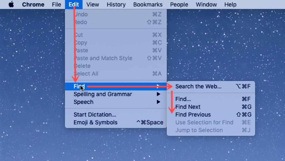
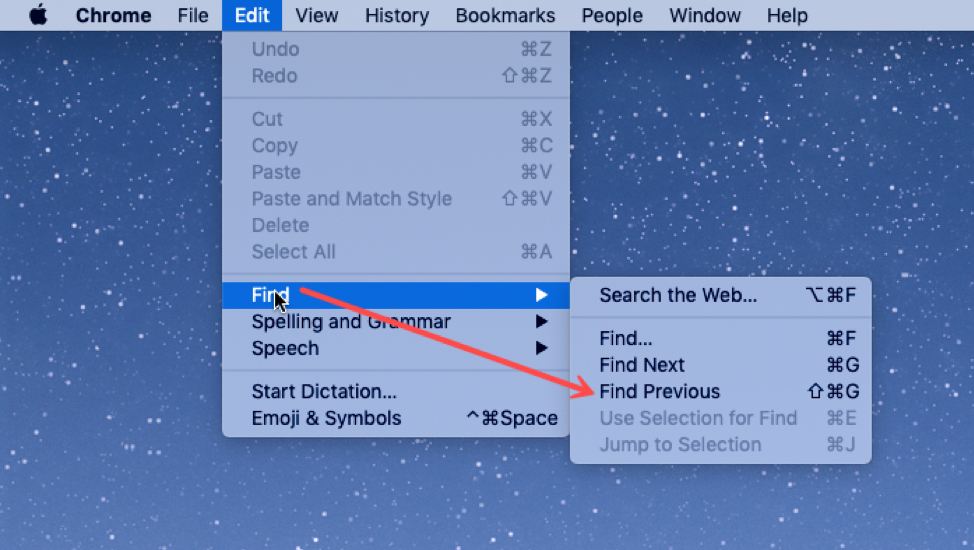
Suppose you selected all your cookie files and tried to delete them all in one go. You get one dialog for every cookie you tried to delete! What button is missing from this dialog?

Microsoft Publishing Wizard

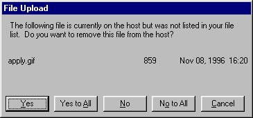
One way to fix the too-many-questions problem is Yes To All and No To All buttons, which short-circuit the rest of the questions by giving a blanket answer. That’s a helpful shortcut, which improves efficiency, but this example shows that it’s not a panacea.

This dialog is from Microsoft’s Web Publishing Wizard, which uploads local files to a remote web site. Since the usual mode of operation in web publishing is to develop a complete copy of the web site locally, and then upload it to the web server all at once, the wizard suggests deleting files on the host that don’t appear in the local files, since they may be orphans in the new version of the web site.

But what if you know there’s a file on the host that you don’t want to delete? What would you have to do?

Eclipse

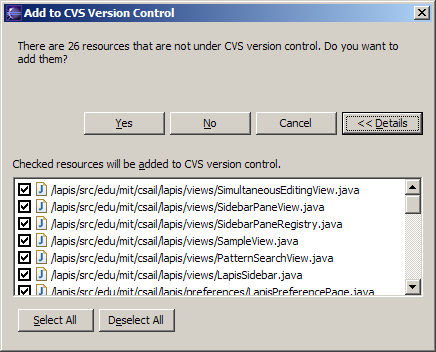
If your interface has a potentially large number of related questions to ask the user, it’s much better to aggregate them into a single dialog. Provide a list of the files, and ask the user to select which ones should be deleted. Select All and Unselect All buttons would serve the role of Yes to All and No to All.

Note that Select All and Unselect All are valuable optimizations for the common cases, where you want to delete (almost) everything or (almost) nothing. But it's still possible to do the uncommon case by looking carefully at each individual checkbox.

Here’s an example of how to do it right, found in Eclipse. If there’s anything to criticize in Eclipse’s dialog box, it might be the fact that it initially doesn’t show the filenames, just their count – you have to press Details to see the whole dialog box. Simply knowing the number of files not under version control is rarely enough information to decide whether you want to say yes or no, so most users are likely to press Details anyway.

Efficiency

Efficiency

Human Information Processing

Model Human Processor

Here’s a high-level look at the cognitive abilities of a human being – really high level, like 30,000 feet. This is a version of the Model Human Processor (MHP), which was developed by Card, Moran, and Newell as a way to summarize decades of psychology research in an engineering model (Card, Moran, Newell, The Psychology of Human-Computer Interaction, Lawrence Erlbaum Associates, 1983).

This model is different from the original MHP; we’ve modified it to include a component representing the human’s attention resources (Wickens, Engineering Psychology and Human Performance, Charles E. Merrill Publishing Company, 1984).

This model is an abstraction, of course. But it’s an abstraction that actually gives us numerical parameters describing how we behave. Just as a computer has memory and processor, so does our model of a human. Actually, the model has several different kinds of memory, and several different processors.

Input from the eyes and ears is first stored in the short-term sensory store. As a computer hardware analogy, this memory is like a frame buffer, storing a single frame of perception.

The perceptual processor takes the stored sensory input and attempts to recognize symbols in it: letters, words, phonemes, icons. It is aided in this recognition by the long-term memory, which stores the symbols you know how to recognize.

The cognitive processor takes the symbols recognized by the perceptual processor and makes comparisons and decisions. It might also store and fetch symbols in working memory (which you might think of as RAM, although it’s pretty small). The cognitive processor does most of the work that we think of as “thinking”.

The motor processor receives an action from the cognitive processor and instructs the muscles to execute it. There’s an implicit feedback loop here: the effect of the action (either on the position of your body or on the state of the world) can be observed by your senses, and used to correct the motion in a continuous process.

Finally, there is a component corresponding to your attention, which might be thought of like a thread of control in a computer system. Note that this model isn’t meant to reflect the anatomy of your nervous system. There probably isn’t a single area in your brain corresponding to the perceptual processor, for example. But it’s a useful abstraction nevertheless.

Human Processor Cycle Time

The main property of a processor is its cycle time, which is analogous to the cycle time of a computer processor. It’s the time needed to accept one input and produce one output.

Like all parameters in the MHP, the cycle times shown above are derived from a survey of psychological studies. Each parameter is specified with a typical value and a range of reported values. For example, the typical cycle time for perceptual processor, Tp, is 100 milliseconds, but various psychology studies over the past decades have reported mean cycle times between 50 and 200 milliseconds. The reason for the range is not only variance in individual humans; it is also varies with conditions. For example, the perceptual processor is faster (shorter cycle time) for more intense stimuli, and slower for weak stimuli. You can’t read as fast in the dark. Similarly, your cognitive processor actually works faster under load. Consider how fast your mind works when you’re driving or playing a video game, relative to sitting quietly and reading. The cognitive processor is also faster on practiced tasks.

It’s reasonable, when we’re making engineering decisions, to deal with this uncertainty by using all three numbers, not only the nominal value but also the range.

Perceptual Fusion

We’ve already encountered one interesting effect of the perceptual processor: perceptual fusion. Here’s an intuition for how fusion works. Every cycle, the perceptual processor grabs a frame (snaps a picture). Two events occurring less than the cycle time apart are likely to appear in the same frame. If the events are similar – e.g., Mickey Mouse appearing in one position, and then a short time later in another position – then the events tend to fuse into a single perceived event – a single Mickey Mouse, in motion.

Fusion also strongly affects our perception of causality. If one event is closely followed by another – e.g., pressing a key and seeing a change in the screen – and the interval separating the events is less than Tp, then we are more inclined to believe that the first event caused the second.

Cognitive Processing

The cognitive processor is responsible for making comparisons and decisions. Cognition is a rich, complex process. The best-understood aspect of it is skill-based decision making. A skill is a procedure that has been learned thoroughly from practice; walking, talking, pointing, reading, driving, typing are skills most of us have learned well. Skill-based decisions are automatic responses that require little or no attention. Since skill-based decisions are very mechanical, they are easiest to describe in a mechanical model like the one we’re discussing.

Two other kinds of decision making are rule-based, in which the human is consciously processing a set of rules of the form if X, then do Y; and knowledge-based, which involves much higher-level thinking and problem-solving.

Rule-based decisions are typically made by novices or occasional performers of a task. When a student driver approaches an intersection, for example, they must think explicitly about what they need to do in response to each possible condition (“is there a stop sign? Are there other cars arriving at the intersection? Who has the right of way?”). With practice, the rules become skills, and you don’t think about how to do them anymore.

Knowledge-based decision making is used to handle unfamiliar or unexpected problems, such as figuring out why your car won’t start.

We’ll focus on skill-based decision making for the purposes of this lecture, because it’s well understood, and because efficiency is most important for well-learned procedures.

Motor Processing

The motor processor can operate in two ways. It can run autonomously, repeatedly issuing the same instructions to the muscles. This is “open-loop” control; the motor processor receives no feedback from the perceptual system about whether its instructions are correct. With open loop control, the maximum rate of operation is one cycle every Tm ~ 70 ms.

The other way is “closed-loop” control, which has a complete feedback loop. The perceptual system looks at what the motor processor did, and the cognitive system makes a decision about how to correct the movement, and then the motor system issues a new instruction. At best, the feedback loop needs one cycle of each processor to run, or Tp + Tc + Tm ~ 240 ms.

Here’s a simple but interesting experiment that you can try: take a sheet of lined paper and scribble a sawtooth wave back and forth between two lines, going as fast as you can but trying to hit the lines exactly on every peak and trough. Do it for 5 seconds. The frequency of the sawtooth carrier wave is dictated by open-loop control, so you can use it to derive your Tm. The frequency of the wave’s envelope, the corrections you had to make to get your scribble back to the lines, is closed-loop control. You can use that to derive your value of Tp + Tc.

Summary

Making Choices

Choice Reaction Time

Simple reaction time – responding to a single stimulus with a single response – takes just one cycle of the human information processor, i.e. Tp+Tc+Tm.

But if the user must make a choice – choosing a different response for each stimulus – then the cognitive processor may have to do more work. The Hick-Hyman Law of Reaction Time shows that the number of cycles required by the cognitive processor is proportional to amount of information in the stimulus. For example, if there are N equally probable stimuli, each requiring a different response, then the cognitive processor needs log N cycles to decide which stimulus was actually seen and respond appropriately. So if you double the number of possible stimuli, a human’s reaction time only increases by a constant.

Keep in mind that this law applies only to skill-based decision making; we assume that the user has practiced responding to the stimuli, and formed an internal model of the expected probability of the stimuli.

KISS principle

Exception: verbal responses to familiar stimuli show much less dependence. Perhaps leveraging brain parallelism?

Scan versus Search

Pull-out Hierarchical Menus

drawbacks we'll discuss later

Fewer Choices is Better

Ideas for Efficiency

Aggregation

multiple selection for action
multiple drag & drop

Hearkening back to the Hall of Fame & Shame for this topic, aggregation is an excellent way to add efficiency to an interface. Think about ways that we can collect a number of items–data objects, decisions, graphical objects, whatever--–and let the user handle them all at once, as a group. Multiple selection is a good design pattern for aggregation, and there are many idioms now for multiple selection with mouse and keyboard (dragging an outline around the items, shift-click to select a range, etc.)

Not every command needs aggregation, however. If the common case is only one item, and it’s never more than a handful of items, then it may not be worth the complexity.

Accelerators

  • Secondary method for doing something faster in a less obvious way
  • e.g. keyboard commands
    • in particular, menu accelerators

A common way to increase efficiency of an interface is to add keyboard shortcuts —- easily-memorable key combinations. There are conventional techniques for displaying keyboard shortcuts (like Ctrl-N and Ctrl-O) in the menubar. Menubars and buttons often have accelerators as well (the underlined letters, which are usually invoked by holding down Alt to give keyboard focus to the menubar, then pressing the underlined letter). Choose keyboard shortcuts so that they are easily associated with the command in the user’s memory.

Keyboard shortcuts can rely on muscle memory: we can type a target key much faster (open loop control) than we can move our mouse to a target location (which requires closed-loop control).

Keyboard operation also provides accessibility benefits, since it allows your interface to be used by users who can’t see well enough to point a mouse. We’ll have more to say about accessibility in a future lecture.

Anticipation

Info or functionality the user needs should be at hand without their needing to go find it

Anticipation means that a good design should put all needed information and tools for a particular task within the user’s easy reach. If the task requires a feature from the interface that isn’t immediately available in the current mode, then the user may have to back out of what they’re doing, at a cost to efficiency.

For example, here’s the File Open dialog in Windows XP. This dialog demonstrates a number of anticipations:

  • The toolbar icons across the top show some evidence of anticipating the user’s needs. Probably the most important is the New Folder icon, which lets you create a new folder to save your file in. Less important when opening, but having it in both dialogs provided consistency
  • The icons on the left side are bookmarks for very common places that users go to open files, like the Desktop or the My Documents folder.
  • The History icon captures another aspect of the file-opening task: that users often need to open a file that they’ve opened recently.
  • If you click on My Network Places, you’ll see more evidence of anticipation: not just a list of the network places that you’ve already created (network places are basically bookmarks pointing to file servers), but also icons for the common subtasks involved in managing the list of network places: Add Network Place to add a new one; and the Network Setup Wizard if you aren’t connected to the network yet.

It’s worth noting that all these operations are available elsewhere in Windows–recently opened files are found in PowerPoint’s File menu, the Network Setup wizard can be found from the Start menu or the Control Panel, and new folders can be made with Windows Explorer. So they’re here only as shortcuts to functionality that was already available–shortcuts that serve both learnability (since the user doesn’t have to learn about all those other places in order to perform the task of this dialog) and efficiency (since even if I know about those other places, I’m not forced to navigate to them to get the job done).

Defaults & Pending Delete

  • Fill in a form with defaults
    • from history, by prediction
  • Make the defaults fragile

Defaults are common answers already filled into a form. Defaults help in lots of ways: they provide shortcuts to both novices and frequent users; and they help the user learn the interface by showing examples of legal entries. They are an anticipation of certain inputs Defaults should be fragile; when you click on or Tab to a field containing a default value, it should be fully selected so that frequent users can replace it immediately by simply starting to type a new value. (This technique, where typing replaces the selection, is called pending delete. It’s the way most GUIs work, but not all. Emacs, for example, doesn’t use pending delete; when you highlight some text, and then start typing, it doesn’t delete the highlighted text automatically.) If the default value is wrong, then using a fragile default allows the correct value to be entered as if the field were empty, so having the default costs nothing.

Incidentally, it’s a good idea to remove the word “default” from your interface’s vocabulary. It’s a technical term with some very negative connotations in the lending world.

History

  • Offer recently-used or frequently-used choices

Many inputs exhibit temporal locality–i.e., the user is more likely to enter a value they entered recently. File editing often exhibits temporal locality, which is why Recently-Used Files menus (like this) are very helpful for making file opening more efficient. Keep histories of users’ previous choices, not just of files but of any values that might be useful. When you display the Print dialog again, for example, remember and present as defaults the settings the user provided before.

Case Study

Idea: dynamic menu changes based on frequent usage patterns.
  • Office 97: frequent items move higher (order by frequency)
  • Gone from office 2001. Why?
    • Consistency
  • Instead, split menu has a group of common items copied to top.
  • Static vs. (auto) Adaptive vs. (manually) Adaptable

Autocomplete

  • Minimize typing with autocomplete
  • another kind of anticipation of what will be typed
  • Autocomplete doesn’t just help with efficiency. What other usability dimensions does it help?
  • Dynamic, just like dynamic menus. Same problem?
    • No, because not used for small fixed set of choices
  • Touches on important issues: overstimulating or rushing the user.
  • Affective computing: how does the interface make the user feel

Autocomplete

Chunking

Efficient Memorability

Working Memory

Working memory is where you do your conscious thinking. The currently favored model in cognitive science holds that working memory is not actually a separate place in the brain, but rather a pattern of activation of elements in the long-term memory. A famous old result is that the capacity of working memory is roughly 7 ± 2 chunks. A recent reanalysis of the same experiment has amended that estimate to 4 ± 1 chunks (Parker, “Acta is a four-letter word,” Acta Psychiatrica Scandinavica, 2012). Either way, it’s pretty small! Although working memory size can be increased by practice (if the user consciously applies mnemonic techniques that convert arbitrary data into more memorable chunks), it’s not a good idea to expect the user to do that. A good interface won’t put heavy demands on the user’s working memory.

Data put in working memory disappears in a short time–a few seconds or tens of seconds. Maintenance rehearsal—repeating the items to yourself—fends off this decay, but maintenance rehearsal requires attention. So distractions can easily destroy working memory.

Long-term memory is probably the least understood part of human cognition. It contains the mass of our memories. Its capacity is huge, and it exhibits little decay. Long-term memories are apparently not intentionally erased; they just become inaccessible.

Maintenance rehearsal (repetition) appears to be useless for moving information into long-term memory. Instead, the mechanism seems to be elaborative rehearsal, which seeks to make connections with existing chunks. Elaborative rehearsal lies behind the power of mnemonic techniques like associating things you need to remember with familiar places, like rooms in your childhood home. But these techniques take hard work and attention on the part of the user. One key to good learnability is making the connections as easy as possible to make–and consistency is a good way to do that.

Chunking

The elements of perception and memory are called chunks. In one sense, chunks are defined symbols; in another sense, a chunk represents the activation of past experience. Chunking is illustrated well by a famous study of chess players. Novices and chess masters were asked to study chess board configurations and recreate them from memory. The novices could only remember the positions of a few pieces. Masters, on the other hand, could remember entire boards, but only when the pieces were arranged in legal configurations. When the pieces were arranged randomly, masters were no better than novices. The ability of a master to remember board configurations derives from their ability to chunk the board, recognizing patterns from their past experience of playing and studying games. (De Groot, A. D., Thought and choice in chess, 1965.)

How many Chunks?

Improve Efficiency of Output

Our ability to form chunks in working memory depends strongly on how the information is presented: a sequence of individual letters tend to be chunked as letters, but a sequence of three-letter groups tend to be chunked as groups. It also depends on what we already know. If the three letter groups are well-known TLAs (three-letter acronyms) with well-established chunks in long-term memory, we are better able to retain them in working memory.

Take advantage of this as a designer: don’t present information as long undifferentiated strings of random characters or numbers. At the very least, break them up into 3- or 4-character groups. Still better, find a way to make the chunks more familiar. This applies not just to random numbers or hashes, but to all kinds of data displayed in an interface.

Example

This is how people signed up for your MIT Athena account. The keywords that you use to prove you have this account coupon are words–much easier to remember and type than the 10-digit, unchunked MIT identifier right above them. (Thanks to Kyle Murray for this example.)

Improve This

Fix this
Volume NameQuotaUsedUsed
u.rcm15,327,671 KB20 GB77%

Improvements

Pointing and Steering

Fitts’s Law

Fitts’s Law specifies how fast you can move your hand to a target of a certain size at a certain distance away (within arm’s length, of course). It’s a fundamental law of the human sensory-motor system, which has been replicated by numerous studies. Fitts’s Law applies equally well to using a mouse to point at a target on a screen. In the equation shown here, reaction time is the time to get your hand moving, and movement time is the time spent moving your hand.

Explanation of Fitts’s Law

We can explain Fitts’s Law by appealing to a simplified model of human information processing. Fitts’s Law relies on closed-loop control. Assume that D >> S, so your hand is initially far away from the target. In each cycle, your motor system instructs your hand to move the entire remaining distance D.

Your motor system can do that in one big motion of roughly constant time, Tm, but the accuracy of that single motion is proportional to the distance moved, so your hand gets within some error εD of the target (possibly undershooting, possibly overshooting). Your perceptual system perceives where your hand arrived in constant time Tp, and your cognitive system compares that location with the target in time Tc. Then your motor system issues a correction to move the remaining distance εD — which it does, but again with proportional error, so your hand is now within ε2D. This process repeats, with the error decreasing geometrically, until n iterations have brought your hand within the target — i.e., εnDS.

Solving for n, and letting the total time T = n (Tp + Tc + Tm), we get:

T = a + b log (D/S)

where a is the reaction time for getting your hand moving, and b = - (Tp + Tc + Tm)/log ε.

Implications of Fitts’s Law

Targets at screen edge are easy to hit

  • infinite size (in one dimension)
  • Mac menubar beats Windows menubar
  • Unclickable margins are a waste

Linear popup menus vs. pie menus

yellkey: end

Fitts’s Law has some interesting implications.

The edge of the screen stops the mouse pointer, so you don’t need more than one correcting cycle to hit it. Essentially, the edge of the screen acts like a target with infinite size. (More precisely, the distance D to the center of the target is virtually equal to S, so T = a + b log (D/S + 1) solves to the minimum time T = a.) So edge-of-screen real estate is precious. The Macintosh menu bar, positioned at the top of the screen, is faster to use than a Windows menu bar (which, even when a window is maximized, is displaced by the title bar).

Similarly, if you put controls at the edges of the screen, they should be active all the way to the edge to take advantage of this effect. Don’t put an unclickable margin beside them.

Fitts’s Law also explains why pie menus are faster to use than linear popup menus. With a pie menu, every menu item is a slice of a pie centered on the mouse pointer. As a result, each menu item is the same distance D away from the mouse pointer, and its size S (in the radial direction) is comparable to D. Contrast that with a linear menu, where items further down the menu have larger D, and all items have a small S (height).

According to one study, pie menus are 15-20% faster than linear menus (Callahan et al. “An empirical comparison of pie vs. linear menus,” CHI 1991). Pie menus are used occasionally in practice–in some computer games, for example, and in the Sugar GUI created for the One- Laptop-Per-Child project. The picture here shows a pie menu for Firefox available as an extension. Pie menus are not widely used, however, perhaps because the efficiency benefits aren’t large enough to overcome the external consistency and layout simplicity of linear menus.

Related to efficiency in general (though not to Fitts’s Law) is the idea of a gesture, a particular movement of the mouse (or stylus or finger) that triggers a command. For example, swiping the mouse to the left might trigger the Back command in a web browser. Pie menus can help you learn gestures, when the same movement of your mouse is used for triggering the pie menu command (note that the Back icon is on the left of the pie menu shown). The combination of pie menus and gestures is called “marking menus”, which have been used with good results in some research systems (Kurtenbach & Buxton, “User Learning and Performance with Marking Menus,” CHI 1994.)

Steering Tasks

Cascading submenus are hard to use, because the mouse pointer is constrained to a narrow tunnel in order to get over into the submenu. Unlike the pointing tasks that Fitts’s Law applies to, this steering task puts a strong requirement on the error your hand is allowed to make: instead of iteratively reducing the error until it falls below the size of the target, you have to continuously keep the error smaller than the size of the tunnel. The figure shows an intuition for why this works. Each cycle of the motor system can only move a small distance d such that the error εd is kept below S. The total distance D therefore takes D/d = εD/S cycles to cover. As a result, the time is proportional to D/S, not log D/S. It takes exponentially longer to hit a menu item on a cascading submenu than it would if you weren’t constrained to move down the tunnel to it.

Windows tries to solve this problem with a 500 ms timeout before opening a submenu, but this means reduced efficiency when the user actually wants to open that submenu.

The Mac gets a Hall of Fame nod here: when a submenu opens, it provides an invisible triangular zone, spreading from the mouse to the submenu, in which the mouse pointer can move without losing the submenu. The user can point straight to the submenu without unusual corrections, and without even noticing that there might be a problem. (Hall of Fame interfaces may sometimes be invisible to the user! They simply work better, and you don’t notice why.)

Example: Steering Tasks on the Web

WSDM 2012 site

Steering tasks are surprisingly common in systems with cascading submenus. Here’s one on a website. Try hovering over Authors to see its submenu. How do you have to move the mouse in order to get to “Paper instructions”?

Fitts’s Law and Steering Law

Fitts’s Law

Time T to move your hand to a target of size S at distance D away is: T = RT + MT = a + b log (D/S + 1)
  • Each cycle covers remaining distance D with error εD

Steering Law

Time T to move your hand through a tunnel of length D and width S is: T = a + b D/S
  • Each cycle covers distance S

We already appealed to this model of closed-loop motor control to help explain why Fitts’s Law is logarithmic in distance and size, while the steering law is linear.

Pull-out Hierarchical Menus

Pull-out Hierarchical Menus

Pull-out Hierarchical Menus

Improve Mouse Efficiency

Now that we’ve discussed aspects of the human cognitive system that are relevant to user interface efficiency, let’s derive some practical rules for improving efficiency.

First, let’s consider mouse tasks, which are governed by pointing (Fitts’s Law) and steering. Since size matters for Fitts’s Law, frequently-used mouse affordances should be big. The bigger the target, the easier the pointing task is.

Similarly, consider the path that the mouse must follow in a frequently-used procedure. If it has to bounce all over the screen, from the bottom of the window to the top of the window, or back and forth from one side of the window to the other, then the cost of all that mouse movement will add up, and reduce efficiency. Targets that are frequently used together should be placed near each other.

We mentioned the value of screen edges and screen corners, since they trap the mouse and act like infinite-size targets. There’s no point in having an unclickable margin at the edge of the screen. Finally, since steering tasks are so much slower than pointing tasks, avoid steering whenever possible. When you can’t avoid it, minimize the steering distance. Cascading submenus are much worse when the menu items are long, forcing the mouse to move down a long tunnel before it can reach the submenu.

Touch Screens?

Many researchers have studied how Fitts's law applies to touch screens. For example,
  • Shiri Azenkot and Shumin Zhai. 2012. Touch behavior with different postures on soft smartphone keyboards. In Proceedings of the 14th international conference on Human-computer interaction with mobile devices and services (MobileHCI ’12). Association for Computing Machinery, New York, NY, USA, 251–260. DOI:https://doi-org.libproxy.mit.edu/10.1145/2371574.2371612
  • Xiaojun Bi, Yang Li, and Shumin Zhai. 2013. FFitts law: modeling finger touch with fitts’ law. In Proceedings of the SIGCHI Conference on Human Factors in Computing Systems (CHI ’13). Association for Computing Machinery, New York, NY, USA, 1363–1372. DOI:https://doi-org.libproxy.mit.edu/10.1145/2470654.2466180

Keystroke level model

Predictive Evaluation

Now we’re going to turn to the question of how we can predict the efficiency of a user interface before we build it. Predictive evaluation is one of the holy grails of usability engineering. There’s something worthy of envy in other branches of engineering–even in computer systems and computer algorithm design–in that they have techniques that can predict (to some degree of accuracy) the behavior of a system or algorithm before building it. Order-of-growth approximation in algorithms is one such technique. You can, by analysis, determine that one sorting algorithm takes O(n log n) time, while another takes O(n^2) time, and decide between the algorithms on that basis. Predictive evaluation in user interfaces follows the same idea.

At its heart, any predictive evaluation technique requires a model for how a user interacts with an interface. This model needs to be abstract – it can’t be as detailed as an actual human being (with billions of neurons, muscles, and sensory cells), because it wouldn’t be practical to use for prediction.

It also has to be quantitative, i.e., assigning numerical parameters to each component. Without parameters, we won’t be able to compute a prediction. We might still be able to do qualitative comparisons, such as we’ve already done to compare, say, Mac menu bars with Windows menu bars, or cascading submenus. But our goals for predictive evaluation are more ambitious.

These numerical parameters are necessarily approximate; first because the abstraction in the model aggregates over a rich variety of different conditions and tasks; and second because human beings exhibit large individual differences, sometimes up to a factor of 10 between the worst and the best. So the parameters we use will be averages, and we may want to take the variance of the parameters into account when we do calculations with the model.

Where do the parameters come from? They’re estimated from experiments with real users. The numbers seen here for the general model of human information processing (e.g., cycle times of processors and capacities of memories) were inferred from a long literature of cognitive psychology experiments. But for more specific models, parameters may actually be estimated by setting up new experiments designed to measure just that parameter of the model.

Advantages of Predictive Evaluation

Predictive evaluation doesn’t need real users (once the parameters of the model have been estimated, that is). Not only that, but predictive evaluation doesn’t even need a prototype. Designs can be compared and evaluated without even producing design sketches or paper prototypes, let alone code.

Another key advantage is that the predictive evaluation not only identifies usability problems, but actually provides an explanation of them based on the theoretical model underlying the evaluation. So it’s much better at pointing to solutions to the problems than either inspection techniques or user testing. User testing might show that design A is 25% slower than design B at a doing a particular task, but it won’t explain why. Predictive evaluation breaks down the user’s behavior into little pieces, so that you can actually point at the part of the task that was slower, and see why it was slower.

Keystroke-Level Model (KLM)

The first predictive model was the keystroke level model (proposed by Card, Moran & Newell, “The Keystroke Level Model for User Performance Time with Interactive Systems”, CACM, v23 n7, July 1978).

This model seeks to predict efficiency (time taken by expert users doing routine tasks) by breaking down the user’s behavior into a sequence of the five primitive operators shown here.

Most of the operators are physical–the user is actually moving their muscles to perform them. The M operator is different–it’s purely mental (which is somewhat problematic, because it’s hard to observe and estimate). The M operator stands in for any mental operations that the user does. M operators separate the task into chunks, or steps, and represent the time needed for the user to recall the next step from long-term memory.

KLM Analysis

Here’s how to create a keystroke level model for a task.

First, you have to focus on a particular method for doing the task. Suppose the task is deleting a word in a text editor. Most text editors offer a variety of methods for doing this, e.g.:

  1. click and drag to select the word, then press the Del key
  2. click at the start and shift-click at the end to select the word, then press the Del key
  3. click at the start, then press the Del key N times
  4. double-click the word, then select the Edit/Delete menu command; etc.

Next, encode the method as a sequence of the physical operators: K for keystrokes, B for mouse button presses or releases, P for pointing tasks, H for moving the hand between mouse and keyboard, and D for drawing tasks.

Next, insert the mental preparation operators at the appropriate places, before each chunk in the task. Some heuristic rules have been proposed for finding these chunk boundaries.

Finally, using estimated times for each operator, add up all the times to get the total time to run the whole method.

Estimated Operator Times

Keystroke from typing speed
0.28 s
average typist (40wpm)
0.08 s
best typist (155 wpm)
1.20 s
worst typist
Button press or release
0.1 s
Highly practiced, no need to acquire button
Drawing from steering law
Pointing determined by Fitts’s Law

	      T = a + b log(D/S + 1) = a + b ID

	      0.8 + 0.1 ID  [Card 1978]
	      0.1 + 0.4 ID  [Epps 1986]
	      -0.1 + 0.2 ID  [MacKenzie '90, mouse select]
	      0.14 + 0.25 ID [MacKenzie '90, mouse drag]

	      OR, for most purposes, just:

	      T ~ 1.1 s for all pointing tasks
	  

Keystroke time can be approximated by typing speed. Second, if we use only an average estimate for K, we’re ignoring the 10x individual differences in typing speed.

Button press time is approximately 100 milliseconds. Mouse buttons are faster than keystrokes because there are far fewer mouse buttons to choose from (reducing the user’s reaction time) and they’re right under the user’s fingers (eliminating lateral movement time), so mouse buttons should be faster to press. Note that a mouse click is a press and a release, so it costs 0.2 seconds in this model.

Pointing time can be modelled by Fitts’s Law, but now we’ll actually need numerical parameters for it. Empirically, you get a better fit to measurements if the index of difficulty is log(D/S+1); but even then, differences in pointing devices and methods of measurement have produced wide variations in the parameters (some of them seen here). There’s even a measurable difference between a relaxed hand (no mouse buttons pressed) and a tense hand (dragging). Also, using Fitts’s Law depends on keeping detailed track of the location of the mouse pointer in the model, and the positions of targets on the screen. An abstract model like the keystroke level model dispenses with these details and just assumes that T ~ 1.1s for all pointing tasks. If your design alternatives require more detailed modeling, however, you would want to use Fitts’s Law more carefully.

Drawing time, likewise, can be modeled by the steering law: T = a + b (D/S).

Estimated Operator Times

0.4 s (between keyboard and mouse) 1.2 s

Homing time is estimated by a simple experiment in which the user moves their hand back and forth from the keyboard to the mouse.

Finally we have the Mental operator. The M operator does not represent planning, problem solving, or deep thinking. None of that is modeled by the keystroke level model. M merely represents the time to prepare mentally for the next step in the method–primarily to retrieve that step (the thing you’ll have to do) from long-term memory. A step is a chunk of the method, so the M operators divide the method into chunks.

The time for each M operator was estimated by modeling a variety of methods, measuring actual user time on those methods, and subtracting the time used for the physical operators–the result was the total mental time. This mental time was then divided by the number of chunks in the method. The resulting estimate (from the 1978 Card & Moran paper) was 1.35 sec–unfortunately large, larger than any single physical operator, so the number of M operators inserted in the model may have a significant effect on its overall time. (The standard deviation of M among individuals is estimated at 1.1 sec, so individual differences are sizeable too.) Kieras recommends using 1.2 sec based on more recent estimates.

Heuristic Rules for adding M’s

One of the trickiest parts of keystroke-level modeling is figuring out where to insert the M’s, because it’s not always clear where the chunk boundaries are in the method. Here are some heuristic rules, suggested by Kieras (“Using the Keystroke-Level Model to Estimate Execution Times”, 2001).

Example: Deleting a Word

Shift-click selection

	      M
	      P [start of word]
	      BB [click]
	      M
	      P [end of word]
	      K [shift]
	      BB [click]
	      H [to keyboard]
	      M
	      K [Del]
	      Total: 3M + 2P + 4B + 1K
	      = 6.93 sec
pressing Del key n times

	      M
	      P [start of word]
	      BB [click]
	      H
	      M
	      K [Del]
	      × n [where n = length of word]
	      Total: 2M+P+2B+H+nK
	      = 4.36 + 0.28n sec

Here are keystroke-level models for two methods that delete a word.

The first method clicks at the start of the word, shift-clicks at the end of the word to highlight it, and then presses the Del key on the keyboard. Notice the H operator for moving the hand from the mouse to the keyboard. That operator may not be necessary if the user uses the hand already on the keyboard (which pressed Shift) to reach over and press Del.

The second method clicks at the start of the word, then presses Del enough times to delete all the characters in the word.

Applications of KLM

Keystroke level models can be useful for comparing efficiency of different user interface designs, or of different methods using the same design.

One kind of comparison enabled by the model is parametric analysis–e.g., as we vary the parameter n (the length of the word to be deleted), how do the times for each method vary?

Using the approximations in our keystroke level model, the shift-click method is roughly constant, while the Del-n-times method is linear in n. So there will be some point n below which the Del key is the faster method, and above which Shift-click is the faster method. Predictive evaluation not only tells us that this point exists, but also gives us an estimate for n.

But here the limitations of our approximate models become evident. The shift-click method isn’t really constant with n–as the word grows, the distance you have to move the mouse to click at the end of the word grows likewise. Our keystroke-level approximation hasn’t accounted for that, since it assumes that all P operators take constant time. On the other hand, Fitts’s Law says that the pointing time would grow at most logarithmically with n, while pressing Del n times clearly grows linearly. So the approximation may be fine in this case.

Empirical Validation of KLM

The developers of the KLM model tested it by comparing its predictions against the actual performance of users on 11 different interfaces: 3 text editors, 3 graphical editors, and 5 command-line interfaces like FTP and chat.

28 expert users were used in the test, most of whom used only one interface, the one they were expert in.

The tasks were diverse but simple: e.g. substituting one word with another; moving a sentence to the end of a paragraph; adding a rectangle to a diagram; sending a file to another computer. Users were told the precise method to use for each task, and given a chance to practice the method before doing the timed tasks.

Each task was done 10 times, and the observed times are means of those tasks over all users.

The results are in figure 6 of Card, Moran & Newell, “The Keystroke Level Model for User Performance Time with Interactive Systems“, CACM, v23 n7, July 1978.

The predicted time for most tasks is within 20% of the actual time. For perspective, civil engineers usually expect that their analytical models will be within 20% error in at least 95% of cases, so KLM is getting close to that.

One flaw in this study is the way they estimated the time for mental operators–it was estimated from the study data itself, rather than from separate, prior observations.

Limitations of KLM

Keystroke level models have some limitations–we’ve already discussed the focus on expert users and efficiency. But KLM also assumes no errors made in the execution of the method, which isn’t true even for experts. Methods may differ not just in time to execute but also in propensity of errors, and KLM doesn’t account for that. KLM also assumes that all actions are serialized, even actions that involve different hands (like moving the mouse and pressing down the Shift key). Real experts don’t behave that way; they overlap operations.

KLM also doesn’t have a fine-grained model of mental operations. Planning, problem solving, different levels of working memory load can all affect time and error rate; KLM lumps them into the M operator.

GOMS

GOMS

GOMS is a richer model that considers the planning and problem solving steps. Starting with the low-level Operators and Methods provided by KLM, GOMS adds on a hierarchy of high-level Goals and subgoals (like we looked at for task analysis) and Selection rules that determine how the user decides which method will be used to satisfy a goal.

Example

Here’s an outline of a GOMS model for the text-deletion example we’ve been using. Notice the selection rule that chooses between two methods for achieving the goal, based on an observation of how many characters need to be deleted.

CPM-GOMS

CPM-GOMS (Cognitive-Motor-Perceptual) and (Critical Path Method) is another variant of GOMS, which is even more detailed than the keystroke-level model. It tackles the serial assumption of KLM, allowing multiple operators to run at the same time. The parallelism is dictated by a model very similar to the Card/Newell/Moran information processing model we saw earlier. We have a perceptual processor (PP), a cognitive processor (CP), and multiple motor processors (MP), one for each major muscle system that can act independently. For GUI interfaces, the muscles we mainly care about are the two hands and the eyes. The model makes the simple assumption that each processor runs tasks serially (one at a time), but different processors run in parallel.

Critical Path Determines Time

We build a CPM-GOMS model as a graph of tasks. Here’s the start of a Point-Shift-click operation.

First, the cognitive processor (which initiates everything) decides to move your eyes to the pointing target, so that you’ll be able to tell when the mouse pointer reaches it.

Next, the eyes actually move (MP eye), but in parallel with that, the cognitive processor is deciding to move the mouse. The right hand’s motor processor handles this, in time determined by Fitts’s Law. While the hand is moving, the perceptual processor and cognitive processor are perceiving and deciding that the eyes have found the target. Then the cognitive processor decides to press the Shift key, and passes this instruction on to the left hand’s motor processor.

In CPM-GOMS, what matters is the critical path through this graph of overlapping tasks – the path that takes the longest time, since it will determine the total time for the method.

Notice how much more detailed this model is! This would be just P K in the KLM model. With greater accuracy comes a lot more work.

Another issue with CPM-GOMS is that it models extreme expert performance, where the user is working at or near the limits of human information processing speed, parallelizing as much as possible, and yet making no errors.

How can we think about today’s Hall of Fame and Shame example, the XBox FTP Client keyboard, in light of the CPM-GOMS model?

Analysis of Phone Operator Workstation

CPM-GOMS had a real-world success story. NYNEX (a phone company) was considering replacing the workstations of its telephone operators. The redesigned workstation they were thinking about buying had different software and a different keyboard layout. It reduced the number of keystrokes needed to handle a typical call, and the keyboard was carefully designed to reduce travel time between keys for frequent key sequences. It even had four times the bandwidth of the old workstation (1200 bps instead of 300). A back-of-the-envelope calculation, essentially using the KLM model, suggested that it should be 20% faster to handle a call using the redesigned workstation. Considering NYNEX’s high call volume, this translated into real money – every second saved on a 30-second operator call would reduce NYNEX’s labor costs by $3 million/year.

But when NYNEX did a field trial of the new workstation (an expensive procedure which required retraining some operators, deploying the workstation, and using the new workstation to field calls), they found it was actually 4% slower than the old one.

A CPM-GOMS model explained why. Every operator call started with some “slack time”, when the operator greeted the caller (e.g. “Thank you for calling NYNEX, how can I help you?”) Expert operators were using this slack time to set up for the call, pressing keys and hovering over others. So even though the new design removed keystrokes from the call, the removed keystrokes occurred during the slack time – not on the critical path of the call, after the greeting. And the 4% slowdown was due to moving a keystroke out of the slack time and putting it later in the call, adding to the critical path. On the basis of this analysis, NYNEX decided not to buy the new workstation. (Gray, John, & Atwood, “Project Ernestine: Validating a GOMS Analysis for Predicting and Explaining Real-World Task Performance”, Human-Computer Interaction, v8 n3, 1993).

This example shows how predictive evaluation can explain usability problems, rather than merely identifying them (as the field study did).

While using the Xbox program ‘Xbox FTP Client’, I stumbled upon this alternative to the tried-and-true approach. The letters are placed like those on a phone pad, three letters and a number to each box. The left analog stick is used to select the box, and the right analog stick is used to highlight the letter/number of your choosing. Once the appropriate glyph is highlighted, you pull the right trigger with your index finger (a very natural motion, with both thumbs resting on the analog sticks) to select the letter/number. Once familiar with the interface, I’ve found I can type my name (‘ryan young’) in about 20 seconds, whereas it takes about 50 seconds with a traditional cursor and keyboard combination.” (example from Ryan Young)

Let’s think about this interface with respect to:

  • learnability (direct or natural mapping? different kinds of consistency?)
  • efficiency

Efficiency vs. Learnability

Are they antithetical or complementary?
  • Command line, abbrevs, hotkeys
  • Wizard/tutorial interfaces
  • "Expert mode"
  • Browse versus search
  • Common tasks at fingertips (are they discoverable?)

Efficiency vs. Learnability

Are they antithetical or complementary?

Speed-Accuracy Tradeoff

Another important phenomenon of the cognitive processor is the fact that we can tune its performance to various points on a speed-accuracy tradeoff curve. We can force ourselves to make decisions faster (shorter reaction time) at the cost of making some of those decisions wrong. Conversely, we can slow down, take a longer time for each decision and improve accuracy. It turns out that for skill-based decision making, reaction time varies linearly with the log of odds of correctness; i.e., a constant increase in reaction time can double the odds of a correct decision.

The speed-accuracy curve isn’t fixed; it can be moved up by practicing the task. Also, people have different curves for different tasks; a pro tennis player will have a high curve for tennis but a low one for surgery.

One consequence of this idea is that efficiency can be traded off against safety. Most users will seek a speed that keeps slips to a low level, but doesn’t completely eliminate them.

Power Law of Practice

One more relevant feature of the entire perceptual-cognitive-motor system is that the time to do a task decreases with practice. In particular, the time decreases according to a power law. The power law describes a linear curve on a log-log scale of time and number of trials.

In practice, the power law means that novices get rapidly better at a task with practice, but then their performance levels off to nearly flat (although still slowly improving).

Summary: Efficiency