Topics for today
- Inheritance
- The Cascade
- Shorthands
- DRY
- Custom properties for cascading variables
p,
em,
mark
elements have the same font family, font size, and color that we set on their ancestor,
body
body? Does it get inherited too?
background
font
border
text-decoration
display
color
padding
white-space
margin
text-shadow
box-shadow
box-sizing
outline
--*
Inherited Not inherited
			border: inherit;
			font-size: initial;
The algorithm that defines how to resolve conflicts.
			h1#title {
				color: red;
			}
			* {
				color: blue !important;
			}
!important?@scope is involved)@layer is involved)
			body {
				background: yellow;
			}
			body {
				background: pink !important;
			}
			button {
				border: none;
			}
			button {
				border: 2px outset #777;
			}
			button {
				border: none;
			}
			button {
				border: 2px outset #777 !important;
			}
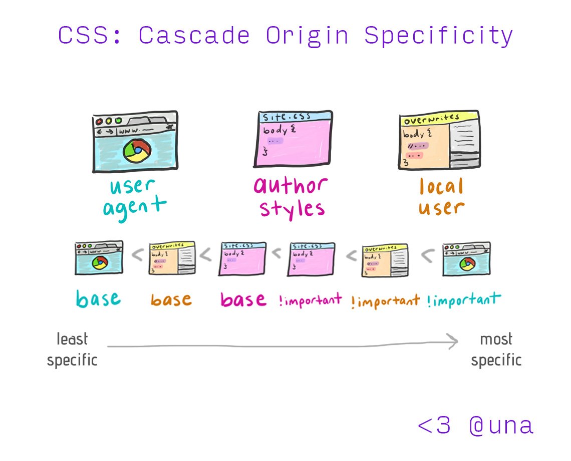
(Unless !important is involved)
#id selectors.classes, :pseudo-classes, [attributes](1, 0, 0) > (0, 100000000, 100000000)
| Selector | Specificity |
|---|---|
style="background: red" |
(∞, ∞, ∞) |
:not(em, strong#foo) |
(1, 0, 1) |
:is(em, #foo) |
(1, 0, 0) |
:where(em, #foo) |
(0, 0, 0) |
.foo.foo.foo:not(#nonexistent)#foo to [id="foo"]:where()* Implicit inheritance, not via the inherit keyword!
!important inverts this)!important?border: .3em dotted steelblue;border: dotted .3em steelblue;border: steelblue .3em dotted;What happens if we swap the order of these two declarations? Why??
padding: .2em .5em .1em .5em;background: url(foo.png) 50% 50% / 100% auto no-repeat gold;background: gold no-repeat 50% 50% / 100% auto url(foo.png);font: 120%/1.5 Helvetica Neue, sans-serif;
			background: url(cat.jpg)
			            0 10% / 100% 100%
			            no-repeat
			            content-box border-box
			            fixed;
			background-image: url(cat.jpg);
			background-position: 0 10%;
			background-size: 100% 100%;
			background-repeat: no-repeat;
			background-origin: content-box;
			background-clip: border-box;
			background-attachment: fixed;
Every piece of knowledge must have a single, unambiguous, authoritative representation within a systemThe Pragmatic Programmer, Andy Hunt and Dave Thomas
			def right_triangle_perimeter(a, b, c):
				return a + b + c

			# ... later on
			p = right_triangle_perimeter(3, 4, 5)
			from math import sqrt

			def right_triangle_perimeter(a, b):
				return a + b + sqrt(a**2 + b**2)

			# ... later on
			p = right_triangle_perimeter(3, 4)
				.red-button {
					background: hsl(0, 80%, 90%);
				}
				.primary-button {
					background: hsl(0, 80%, 90%);
				}
				button {
					border-radius: 5px;
					padding: 5px 12px 6px;
					font-size: 24px;
					line-height: 24px;
				}
				button.large { font-size: 46px; }
				button {
					border-radius: .2em;
					padding: .2em .5em .25em;
					font-size: 100%;
					line-height: 1;
				}
				button.large { font-size: 200%; }
				.tab {
					border-radius: .3em .3em 0 0;
					padding: .1em .5em .1em .5em;
					margin: 0 .1em 0 .1em;
				}
				.tab {
					border-radius: .3em;
					border-bottom-left-radius: 0;
					border-bottom-right-radius: 0;
					padding: .1em .5em;
					margin: 0 .1em;
				}
Three strikes and you refactor
Duplication is far cheaper than the wrong abstractionSandy Metz
-- and behave like normal CSS properties.var() function and we can use that anywhere (including inside calc()), except inside url().