Topics
- When & why to use animation
- Implementation: How?
- Accessibility
Motion design informs users by highlighting relationships between elements, action availability, and action outcomes
Motion orients users by showing how elements in a transition are related.
Motion indicates the hierarchical relationship between “Dogs” and “Cats,” peer items in the navigation.
Animated list items are placeholders that convey content is loading.
Motion of a card makes selection, positioning, and release visible.
The swipe-to-open action is animated to invite and encourage the necessary gesture.
The motion path of an item into a shopping cart teaches users the location of the selected item. This follows the same principle as the minimize example we saw earlier.
Motion focuses attention on what's important, without creating unnecessary distraction.
Movement in a person’s peripheral vision triggers a stimulus-driven shift in visual attention and is an example of bottom–up processing. This is in contrast to a goal-directed shift (top–down processing), where a person voluntarily adjusts attention to an area of interest. The instinctual attention shift to motion is a remnant of the days when we needed to quickly notice a snake in the grass and other forms of looming danger or potential prey.On a web page, the periphery generally includes any areas outside the F-shaped pattern of reading. Blinking images and video advertisements in the right rail are the most obvious examples of utilizing peripheral animation for business-oriented goals (with their overuse leading to banner blindness and right-rail blindness), but even well-meaning animations can prove to be distracting and annoying (Clippy, we’re looking at you). Notifications appearing near the edges of the screen and promoting related content, recent activity, or the capability of live chat are all examples of peripheral animation that is intended to alert the user to relevant features or content, but in practice can be as interrupting and unwanted as a pop-up window.
Let's try an experiment. Start reading this quote
How fast visual attention shifts toward a moving object in the periphery depends on the perceived animacy of the object. Factors such as the increasing speed of the object, the magnitude of its shift in position, and, whether this motion appears to be self-propelled (rather than caused by an external collision of some sort) all influence the perception of animacy. This means that elements that slide in or otherwise display a shift in position at any degree of speed will attract attention faster than elements that slowly fade in.
Shortly after loading the homepage of Olark, a How can we help? window slides up from the bottom right of the screen with an additional Hey … window then popping up above it. While the animation certainly succeeds in alerting the user to the existence of the chat feature, its sudden appearance in the periphery of the user’s vision distracts from the primary task of consuming the main content of the page.
Source and media credits: NNGroup
The Back to Top link on the Festival of Marketing site slides up from the bottom left of the page as the user scrolls, a motion which immediately draws attention toward the element in the periphery of the screen and distracts from the main task of reading the main page content.
Source and media credits: NNGroup
The arrow button to scroll back to the top of the page slowly fades in at the right edge of the screen as the user scrolls down the page. This slow animation with no position change is less visually distracting than the slide-in animation seen in the previous example. Of course, another solution, which avoids the issue of possibility interrupting the user from the task of browsing products, is to always display the link somewhere within the page.
Source and media credits: NNGroup
Read the room
Consider the situation at hand, and the user's mood. This is an example from a Mac code editor called Espresso. When using "Go to line…", there is an animation of the popup disappearing, before the editor actually scrolls to the line requested. It does not communicate anything, it’s purely decorative. While such animations might be a delight in some cases, when debugging, users are typically frustrated already, and very goal-oriented. They don't have time for delight. They want to move on, fast. An their patience for gratuitous animation decreases even more with every additional line they need to look up.
Motion celebrates moments in user journeys, adds character to common interactions, and can express a brand’s style.
Made an SVG animated login avatar, with the help of some trigonometry & GSAP. #animation #UX #gsap
— Darin Senneff (@dsenneff) February 19, 2018
Animating icons can playfully reinforce or add to the icon’s meaning.
Subtle animation in icons, illustrations, and product logos can add polish and playfulness to the user experience.
The icon animations in Owl, an educational app, are designed to reflect its colorful brand.
The main menu of Newton Running is revealed at the end of a lengthy animation sequence, which is then played in reverse once an option has been selected. Whenever users want to use the main menu, they must endure the entire animation sequence again. Gratuitous, purposeless animations discourage the user from interacting further with the website, as they needlessly waste precious time that could be spent absorbing actual content.
Source and media credits: NNGroup
Another important aspect to consider when designing an animation is the frequency with which it would likely occur within a single visit of a typical user. Animations that are repeatedly encountered are roadblocks to content and lengthen the amount of time to complete a task. Users do not want to wait and watch a lengthy animation sequence over and over again, especially when it has no purpose other than being “fun” and showing off the coding capabilities of the developer. Remember: just because you can implement an animation, it doesn’t mean that you should.
Crane’s animated logo indicates hierarchy, but also adds polish and an extra moment of delight.
transition makes style changes smooth, whenever possible.transition-duration, transition-delay, transition-property, transition-timing-functiontransition and its longhands accept comma-separated lists, to create multiple transitions with different parameters for different properties.cubic-bezier() function. cubic-bezier.com allows you to generate these visually.@keyframes rule.animation property.animation property is actually a shorthand for:
animation-name: Which animation to run?animation-duration: How long should each iteration last?animation-delay: Any delay before it starts?animation-iteration-count: How many times should it play? (number or infinite)animation-timing-function: How should it progress over time?animation-direction: Should any iterations be reversed?animation-fill-mode: How should it behave before and after it’s applied?animation-play-state: Should it be paused?animationstart, animationiteration, and animationend events.Easing adjusts an animation’s rate of change, so transitioning elements speed up and slow down. In the physical world, objects don’t start or stop instantaneously. Easing is a technique that makes elements move as though natural forces like friction, gravity, and mass are at work.
linear, ease (default), ease-in, ease-out, ease-in-outcubic-bezier()steps(), step-start, step-end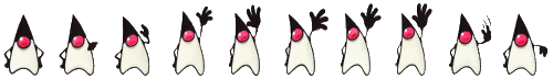
			requestAnimationFrame(function scroll() {
				let html = document.documentElement;
				html.scrollTop += 10;

				if (html.scrollTop +
				    innerHeight <
				    html.scrollHeight) {
					requestAnimationFrame(scroll);
				}
			});
			@media (prefers-reduced-motion) {
				* {
					/* Too drastic, but better than nothing */
					animation: none !important;
				}
			}
			const MOTION = !matchMedia('(prefers-reduced-motion)').matches;

			if (!MOTION) {
				requestAnimationFrame(...);
			}
For each animation or interaction you’re planning, ask yourself, “If this effect was stronger (much faster, or bouncier, or swoopier), would it be disorienting, or make me feel motion-sick?” If the answer is yes, then you can rest assured there are plenty of people in the world whose threshold is already low enough to be bothered.