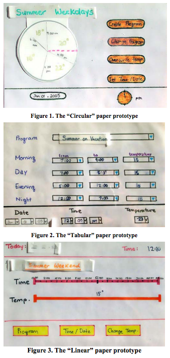
Part of the power of paper prototypes is the depth you can achieve by having a human simulate the backend. A Wizard of Oz prototype also uses a human in the backend, but the frontend is an actual computer system instead of a paper mockup. The term Wizard of Oz comes from the movie of the same name, in which the wizard was a man hiding behind a curtain, controlling a massive and impressive display.
In a Wizard of Oz prototype, the "wizard" is usually but not always hidden from the user. Wizard of Oz prototypes are often used to simulate future technology that isn't available yet, particularly artificial intelligence. A famous example was the listening typewriter (Gould, Conti, & Hovanyecz, “Composing letters with a simulated listening typewriter”, *CACM* v26 n4, April 1983). This study sought to compare the effectiveness and acceptability of isolated-word speech recognition, which was the state of the art in the early 80's, with continuous speech recognition, which wasn't possible yet. The interface was a speech-operated text editor. Users looked at a screen and dictated into a microphone, which was connected to a typist (the wizard) in another room. Using a keyboard, the wizard operated the editor showing on the user's screen.
The wizard's skill was critical in this experiment. She could type 80 wpm, she practiced with the simulation for several weeks (with some iterative design on the simulator to improve her interface), and she was careful to type exactly what the user said, even exclamations and parenthetical comments or asides. The computer helped make her responses a more accurate simulation of computer speech recognition. It looked up every word she typed in a fixed dictionary, and any words that were not present were replaced with X's, to simulate misrecognition. Furthermore, in order to simulate the computer's ignorance of context, homophones were replaced with the most common spelling, so "done" replaced "dun", and "in" replaced "inn". The result was an extremely effective illusion. Most users were surprised when told (midway through the experiment) that a human was listening to them and doing the typing.
Thinking and acting mechanically is harder for a wizard than it is for a paper prototype simulator, because the tasks for which Wizard of Oz testing is used tend to be more "intelligent". It helps if the wizard is personally familiar with the capabilities of similar interfaces, so that a realistic simulation can be provided. (See Maulsby et al, ["Prototyping an intelligent agent through Wizard of Oz"](http://luca.bisognin.online.fr/icp/biblio/University_of_Calgary/maulsby93prototyping.pdf), CHI 1993.) It also helps if the wizard's interface can intentionally dumb down the responses, as was done in the Gould study.
A key challenge in designing a Wizard of Oz prototype is that you actually have two interfaces to worry about: the user's interface, which is presumably the one you're testing, and the wizard's.


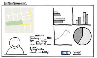
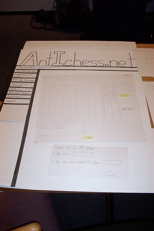
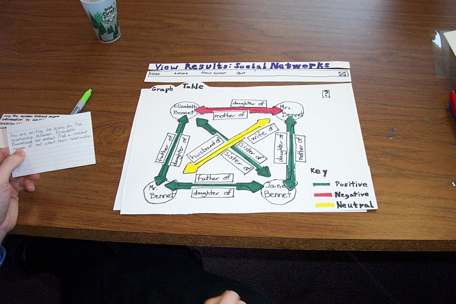
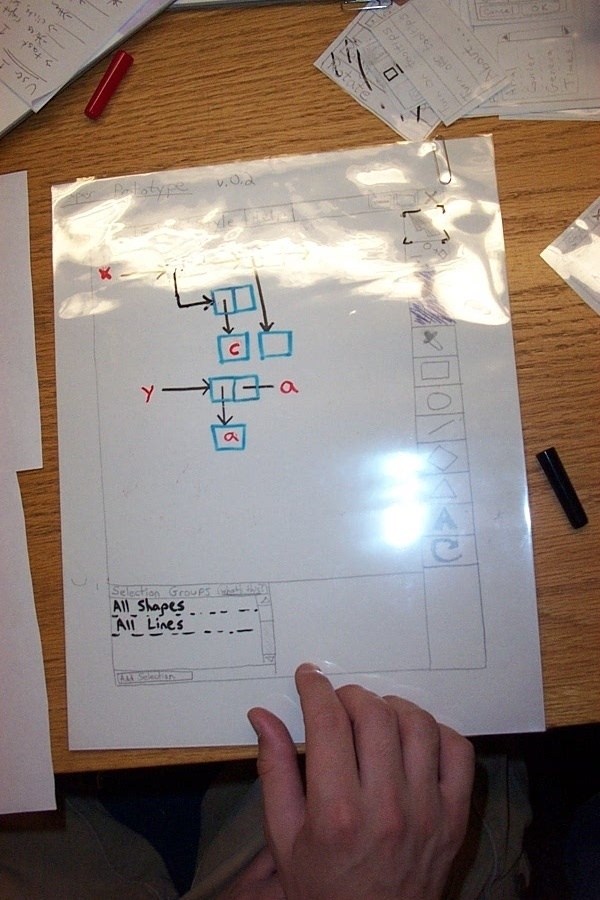
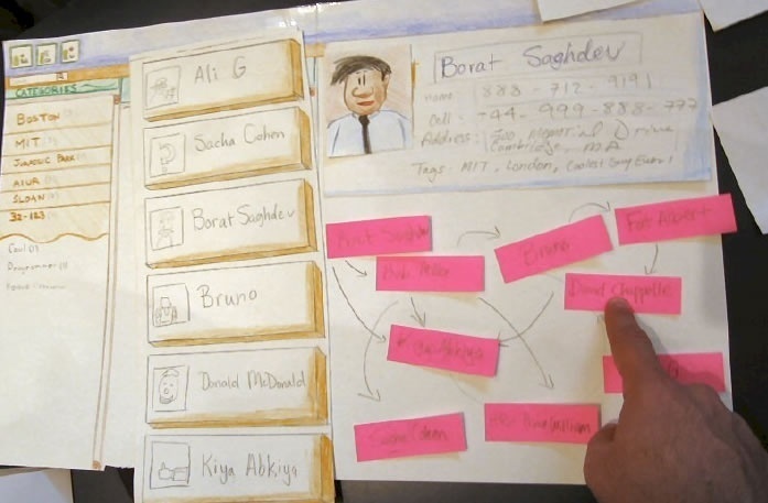
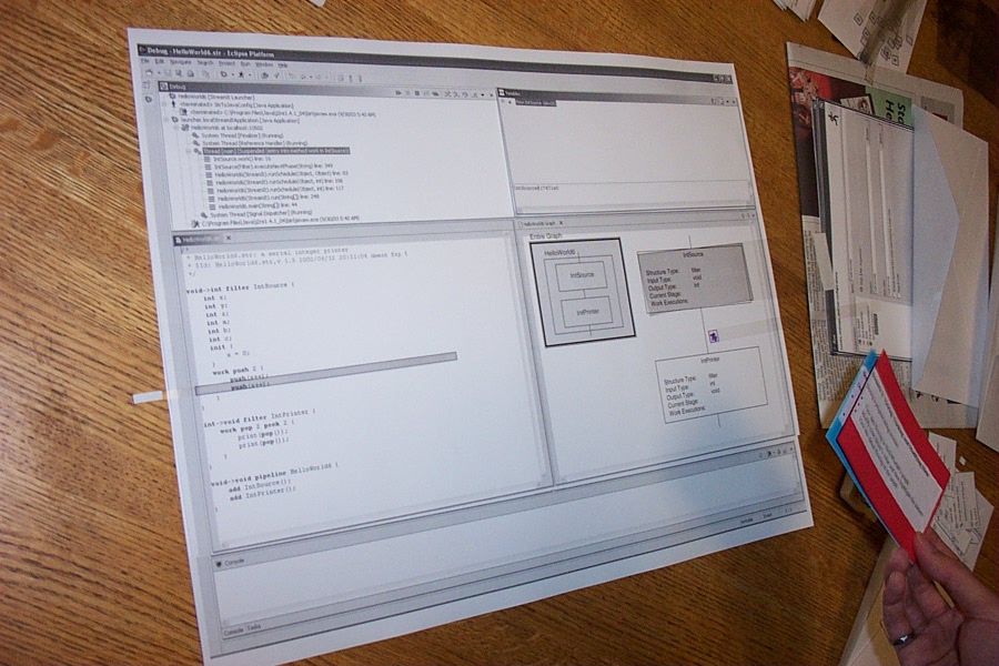 Eclipse
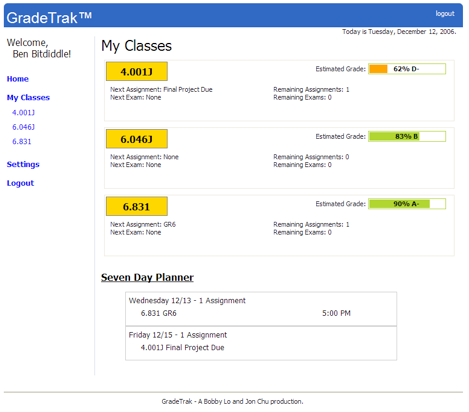
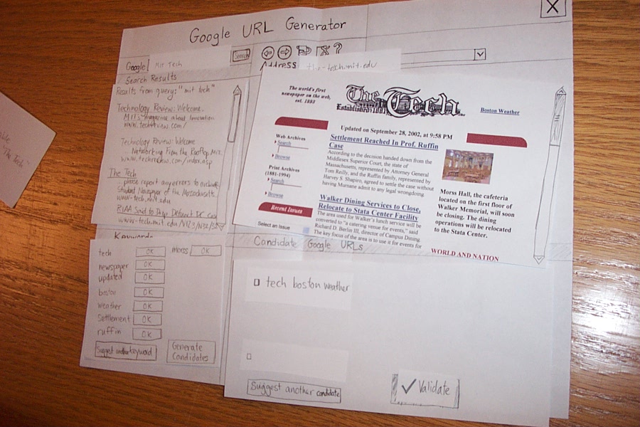 Web browser tool
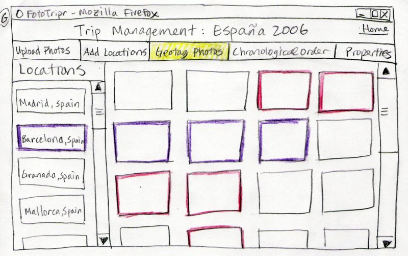
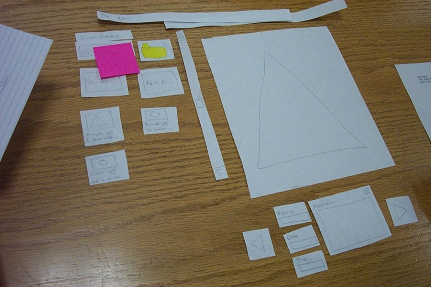 Photo album

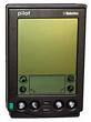
 First Palm Pilot “prototype”